Week Four:
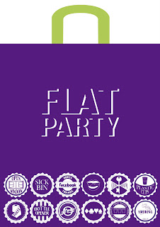
From Fridays crit I realised the importance of the packaging for the pack, and how it could become quite interactive. I like the idea it being a bag that could be re-used, as when people go to flat parties they usually would bring alcohol in a plastic bag. This also makes it relevant to 'parties'.
Another issue raised in the crit when talking about safety at parties was to look at the 'Recovery Position' and how it could be used in a comical way, yet also being a serious piece of information.
I am going to research into this and think of different ways in which it could mayeb use it.
I think it would be a novelty item and also funny to have a matt with a human outline of a person (like a police scene) in the recovery position, to be placed in a specific area in the party room. Assisted with some information on what to do.
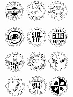
For the 'check list' I had been trying to come up with different ways of making it visually engaging, and I particularly like the look of bottle caps. I think they are relevant to the party theme as 'alcohol' is consumed at them, and they are a good visual when set together in different colours. I have started to come up with my own little pictograms for each instrution on the check list and began making my own bottle caps. I think it would be useful if I had 'what to do' on the bottle cap, and then 'the reason why it should be done' on the reverse side. Here are a few drawn examples:
I re-created these in illustrator, experimenting with different colour combinations:
Chosen 12 for check list (front and back)
In my next crit, I was told to think about creating the check list as badges. This would be novelty items as the students would be able to keep them and pin them to different things as well as having the concept behind them, of a check list. I really liek this idea and I will try to create some badges. However, with the design only being able to go on one side. I will probably have to put the information for each badge, on the card that they pin onto.
I couldn't fidn anywhere that sold badge makers so I bought 12 birthday badges to take apart and put my own designs on:


Thinking of the deisgns for the poster I took panaramic photos of my flat. I tried to include typical things such as the kitchen, sofa, music system, table, chairs. I drew this out and stenciled it onto photoshop so I could manipulate it.
Ideas:
Bag Design Ideas:
In the crit I was told the logo I had chosen was hard to read. I also think it is boring so I will re-design this. However, I just want the words 'flat party' ont he bag deisgn to keep it simple and straigth to the point.


No comments:
Post a Comment