Showing posts with label brief 4. Show all posts
Showing posts with label brief 4. Show all posts
Tuesday, 13 December 2011

Wednesday, 7 December 2011
Brief 4 - Waven - Pitch Boards
Here are the design boards I handed in for Paul, to explain the my ideas for the concept.
The images and information I will be able to use again, maybe with a few tweaks and changes, and the addition of an extra board where I have developed some ideas for the tags, etc.
The images and information I will be able to use again, maybe with a few tweaks and changes, and the addition of an extra board where I have developed some ideas for the tags, etc.
Tuesday, 6 December 2011
Brief 4 - Waven - denim details
I created a pocket deign that would mean the back pocket have the Swedish A woven into them so the stitching is obvious. This could be a mark of authenticity that the A is actually woven into the denim.



The rivets design would just be the 'o' for th top of the A - again to create emphasis


Brief 4 - Waven - Type & Image
I used a combination of the logo and photographs of the natural environment. To go with the concept of making the brand look more environmentally conscious (The majority of Sweden is cover in mountain, forest, lakes and rivers).
The photograph would be monochrome printed in the dark blue/green colour from the colour scheme and the logo in green to make it stand out. I used the rule of thirds for the composition with the logo on the last third, so as their is still focus on the image and the logo doesn't retract the consumer attention away from it too far. This always the consumer to consciously associate the brand with the environment.
The photograph would be monochrome printed in the dark blue/green colour from the colour scheme and the logo in green to make it stand out. I used the rule of thirds for the composition with the logo on the last third, so as their is still focus on the image and the logo doesn't retract the consumer attention away from it too far. This always the consumer to consciously associate the brand with the environment.
Monday, 5 December 2011
Brief 4 - Waven - Plantable Card
I had the idea of having a swing tag as a plantable card, that the consumer can use to grow their own cotton - which marks the start of the denim process.
Th idea is that denim 'bloom's and gets better over time, the more it is worn - this represents the growth of the cotton crop. It also lets the consumer go back to the origin of denim - and sees it at its most organic point.
The product will also be sustainable and eco-friendly with it being reusable and biodegradable stock. This complies with modern materials and means the brand itself has an eco-friendly image and is conscious about the environment.
The card will have to have instructions on how to grown the cotton so I looked at step by steps of doing this as this will be the easiest way of understanding the process.
Grow your own Cotton:
Step 1: Prepare Pot - Fill your pot 2/3 full with compost soil and keep in a warm place above 14°C with splenty of sunlight.
Step 2: Plant Card - Plant the attached card upright, and cover with more soil so it is about 2.5cm below the surface.
Click Here
When considering the designs for this, it is a piece of information graphics to needs to be easy to follow and made to look interesting and inspiring.


I used the step-by-step instructions in a list form with the use of images to represent each one of the four stages and break the steps up a bit. However, I don't feel that the images worked well for the designs and for the brand itself. I also experimented with typeface to try and get the right feel for the brand, being quirky and contemporary, and I think the typeface that I have used for the tagline (Pirulen Rg) works the best as it keeps consistency with the brand, I used it for the headers and I have used Tahoma for the body text. These two typefaces seem to work well and are clear and easy to read.
The scale off the instructions page will cover a double page on the inside of the swing tag measuring 105 x 148mm (portrait works better than landscape)
When the swing ticket is folded shut it measures 74 x 105mm
Th idea is that denim 'bloom's and gets better over time, the more it is worn - this represents the growth of the cotton crop. It also lets the consumer go back to the origin of denim - and sees it at its most organic point.
The product will also be sustainable and eco-friendly with it being reusable and biodegradable stock. This complies with modern materials and means the brand itself has an eco-friendly image and is conscious about the environment.
The card will have to have instructions on how to grown the cotton so I looked at step by steps of doing this as this will be the easiest way of understanding the process.
Grow your own Cotton:
Step 1: Prepare Pot - Fill your pot 2/3 full with compost soil and keep in a warm place above 14°C with splenty of sunlight.
Step 2: Plant Card - Plant the attached card upright, and cover with more soil so it is about 2.5cm below the surface.
Step 3: Water
After planting the card, water the surface. You should not water them again until 5 weeks after the plant has emerged. Then water once every 10 days.
Step 4:Grow
Stop watering the plant altogther 16 weeks after planting the card. This will cause the plant to dry up and shed it’s leaves. The buds will burst open, revealing the cotton fibre.
When considering the designs for this, it is a piece of information graphics to needs to be easy to follow and made to look interesting and inspiring.


I used the step-by-step instructions in a list form with the use of images to represent each one of the four stages and break the steps up a bit. However, I don't feel that the images worked well for the designs and for the brand itself. I also experimented with typeface to try and get the right feel for the brand, being quirky and contemporary, and I think the typeface that I have used for the tagline (Pirulen Rg) works the best as it keeps consistency with the brand, I used it for the headers and I have used Tahoma for the body text. These two typefaces seem to work well and are clear and easy to read.
The scale off the instructions page will cover a double page on the inside of the swing tag measuring 105 x 148mm (portrait works better than landscape)
When the swing ticket is folded shut it measures 74 x 105mm
Brief 4 - Waven - Clothing Tags
This swing tag will be attached to the plant-able paper which will have the A logo. This gives the tag its own unique touch, with the idea that denim 'bloom's' over time, the more it is worn.
The swing tag will also be sustainable and Eco-friendly with it being reusable and biodegradable stock, This gives the brand an Eco-friendly image, and shows it is conscious about the environment.
On the inside of the folding swing tag is the instructions on how to grow the cotton.


Here are the size that hat would be on their clothing to make it easier for people to find their size. The range of cuts, and range of washes have different colours to represent each one.
Breif 4 - Waven - Final Logo design
Open publication - Free publishing - More logo
I chose this as my final logo design
The logo needs to represent the idea of being woven together and also have emphasis on the Swedish A. it needs to intrgue the audience and be memorable and recogniseable as a denim brand. When people realise the A is pornounced 'o', thsi created ownership when the consumer get's it.
The typeface used is Fenix BlackletterCaps and creates a strong bold appearance, and the slant of the letterforms to help them fit toegther portrays the idea of being 'close nit'. The weavign line between the letter that passes throuhg the circle of the Swedish A further relates to the denim process.
The tagline typeface is Pirulen Rg - Regular - which is also bold and stands its ground alongside the brand name.
The colour scheme used made up of 5 colours plus black and white draws subtle associations with Sweden which further strengthens the Swedish A. it also could be associated with the natural environment.
The logo can be used in black, reversed out or full colour.
The A alone, or the circle from the Swedish A with the passing through line, could be used as another logo, and once the brand is known it could be recognizable.

I chose this as my final logo design
The logo needs to represent the idea of being woven together and also have emphasis on the Swedish A. it needs to intrgue the audience and be memorable and recogniseable as a denim brand. When people realise the A is pornounced 'o', thsi created ownership when the consumer get's it.
The typeface used is Fenix BlackletterCaps and creates a strong bold appearance, and the slant of the letterforms to help them fit toegther portrays the idea of being 'close nit'. The weavign line between the letter that passes throuhg the circle of the Swedish A further relates to the denim process.
The tagline typeface is Pirulen Rg - Regular - which is also bold and stands its ground alongside the brand name.
The colour scheme used made up of 5 colours plus black and white draws subtle associations with Sweden which further strengthens the Swedish A. it also could be associated with the natural environment.
The logo can be used in black, reversed out or full colour.
The A alone, or the circle from the Swedish A with the passing through line, could be used as another logo, and once the brand is known it could be recognizable.

Thursday, 1 December 2011
Progress Surgery with Lorenzo
here is some feedback and some things I need to clarify as taken from the progress surgery I had today with Lorenzo.
Final Design Boards
- should link any gaps - smooth story of brief
-full range shot
-photograph in context where possible
Brief 2 - I tried to mainly foci on this brief as it was th even I was most struggling with making the concept clear enough. So I need to :
- clarify why stencils are begin used
-work out mail shot and who the consumer interacts with it - what information needs to be included
-work in the language used to strengthen then concept - 'use your instincts'
- Fedrigoni wild is in our DNA
Brief 4 - WAVEN - I was taking ages in creating the logo for this, so I need to focus it down to one and see how far I could develop it so it looked right for the brand, as I had too many ideas.
- I decided to go with the idea of have a thread through the 'o' at the top of the Swedish A to bring the weaving process into the logo design.
Brief 4 - WAVEN - I was taking ages in creating the logo for this, so I need to focus it down to one and see how far I could develop it so it looked right for the brand, as I had too many ideas.
- I decided to go with the idea of have a thread through the 'o' at the top of the Swedish A to bring the weaving process into the logo design.
Wednesday, 30 November 2011
Brief 4 - WAVEN - Logo Typeface
Here are a few typefaces that I feel could reflect the brand. They are bold and clear:

These other typeface are still bold but have more to them in terms of being more visually interesting and they look less corporate:

I changed the A to the Swedish A and changed the kerning of the letters to make them more balanced. I feel these are more visually interesting than the arial typeface and have an edge to them.


These other typeface are still bold but have more to them in terms of being more visually interesting and they look less corporate:

I changed the A to the Swedish A and changed the kerning of the letters to make them more balanced. I feel these are more visually interesting than the arial typeface and have an edge to them.

Colour Schemes
I found these colour schemes on colour lover.com,
These relate to Sweden


These relate to denim and twill.

These relate to Sweden


These relate to denim and twill.

OUGD301 - Brief 4 - WAVEN - Logo
Working from the previous logo designs I did in Illustrator here are some more that cary on from these. I tried to make it look less corporate by experimenting with dash lines to represent stitch and make it appear to relate to denim bait more. I need to experiment with colour schemes and come away from this obvious blue and yellow, which I have just used to make the type and circle separate.
Open publication - Free publishing - More brand
After this I got told the logo with the A and the large circle looks like a ferris wheel! So that is not something I want the brand to be associated with so I have chosen to to use this. However I found this image of a piece of machinery used within the denim making process which has a look of it. Suppose it is something that could be associated with it, but I don't think it is obvious enough:

After this I got told the logo with the A and the large circle looks like a ferris wheel! So that is not something I want the brand to be associated with so I have chosen to to use this. However I found this image of a piece of machinery used within the denim making process which has a look of it. Suppose it is something that could be associated with it, but I don't think it is obvious enough:


Thursday, 24 November 2011
OUGD301 - wAven - Logo design ideas
I experimented with my logo ideas in illustrator so I could get theme more precise and experiment with colour more.
I tried to get the lines of the word WAVEN at the same angles, which meant putting the E and N on a slant. This I thought made the letters fit together better that they are a close nit 'weave'.

I played around with emphasising the circle of the Swedish A by using a larger circle in a different colour that intertwined with the letters an replaced the cross bar on the A. This I feel could work alone as a single logo, and could even work as a swing tag on the clothing. I really like the look of this and feel it could be recognisable as the WAVEN brand once the associations have been made. I need to experiment more with colour, and also with the typeface. I feel the logo as a whole is looking too corporate, however I think it needs to be kept quite simple and clear and not distracting or too busy. The blue used looks quite 'flat' and maybe using different colour schemes will develop this logo into something better.
I tried to get the lines of the word WAVEN at the same angles, which meant putting the E and N on a slant. This I thought made the letters fit together better that they are a close nit 'weave'.

I played around with emphasising the circle of the Swedish A by using a larger circle in a different colour that intertwined with the letters an replaced the cross bar on the A. This I feel could work alone as a single logo, and could even work as a swing tag on the clothing. I really like the look of this and feel it could be recognisable as the WAVEN brand once the associations have been made. I need to experiment more with colour, and also with the typeface. I feel the logo as a whole is looking too corporate, however I think it needs to be kept quite simple and clear and not distracting or too busy. The blue used looks quite 'flat' and maybe using different colour schemes will develop this logo into something better.
OUGD301 - WAVEN - Story
I has some ideas for the story of the brand, bearing in mind a few things..
The target audience is:
-18 - 30 year old
-men and women
-contemporary dressed
The tone of voice used should be
-light hearted
-humourous?
-quirky

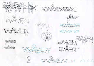
DNA Idea-
Similarly along the lines of Bluelood denim (indigo running through their veins), it could be that the consumer of the WAVEN brand has WAVEN woven into their DNA, or the jeans have WAVEN DNA. I thought about how the logo could be used alongside this working with the structure of DNA. The circle on the Swedish A acts as an addition to the DNA structure, which is something different to normal DNA. Personal unique things such as eye colour or fingerprints could be used within the logo to represent the WAVEN DNA as a more subtle side to the structure. Jeans = Genes

SWEDISH PRIDE Idea -
The idea that once you've tried them you'll never go back. A sort of spin off about sexuality and trying new things.
-Taking Gay Pride and having 'woven with Swedish Pride' as a tagline.
-The packaging design for the clothes could be about coming out of the closet, again referring to sexuality but with a different meaning as the clothes get taking out of the closet/wardrobe were they are stored to be worn.
-The subject is bit tongue in cheek as it is still bait of a taboo subject - and this can reflect the peculiarity of the Swedish A.
The target audience is:
-18 - 30 year old
-men and women
-contemporary dressed
The tone of voice used should be
-light hearted
-humourous?
-quirky


DNA Idea-
Similarly along the lines of Bluelood denim (indigo running through their veins), it could be that the consumer of the WAVEN brand has WAVEN woven into their DNA, or the jeans have WAVEN DNA. I thought about how the logo could be used alongside this working with the structure of DNA. The circle on the Swedish A acts as an addition to the DNA structure, which is something different to normal DNA. Personal unique things such as eye colour or fingerprints could be used within the logo to represent the WAVEN DNA as a more subtle side to the structure. Jeans = Genes

SWEDISH PRIDE Idea -
The idea that once you've tried them you'll never go back. A sort of spin off about sexuality and trying new things.
-Taking Gay Pride and having 'woven with Swedish Pride' as a tagline.
-The packaging design for the clothes could be about coming out of the closet, again referring to sexuality but with a different meaning as the clothes get taking out of the closet/wardrobe were they are stored to be worn.
-The subject is bit tongue in cheek as it is still bait of a taboo subject - and this can reflect the peculiarity of the Swedish A.
Brief 4 - WAVEN -Swedish Heritage
I researched into the country of Sweden to gather some more information about the type of country it is, and thought about how I could link the Swedish Heritage/Spirit. I have highlighted a few that I think are quite interesting.
-The country is known as the Kingdom of Sweden as is on the Scandinavian Peninsula in Northern Europe.
-The glad is blue with a below cross - the colours are taken from the Swedish Coat of Arms
-The capital city of Stockholm - which is made up of 14 Islands
-The currency is Swedish Krona (SEK)
-The total population of Sweden is around 9.3million
-85% of Sweden live in urban areas.
-It is a country of parliamentary democracy.
-It covers an areas of 450,000km2
-53% forests
-11% mountains
-8% cultivated land
-9% lakes and river
-15 % of Sweden lies north of the Arctic Circle
-Southern Sweden is predominantly agricultural with increasing forest coverage northward.
-It is the land of the midnight sun. (colour scheme)
-It is divided into 21 countries
-It is a neutral country at peace - peacetime and neutrality in war time.
-People have the medieval right "The Right to Public Access'.
-The Swedish National Day is on June 6th.
-It is the Land of the Vikings - 'Rus'
-Northern Lights - The best viewing areas in Sweden are above the Arctic Circle between September and March - they are caused by the energy from the Sun carried towards Earth on solar winds.
-Sweden have special signs that Bargin Hunters look out for:
-REA - means Sale
-Extapris - used along side red labels indicates discounts of at least 10%
-Fynd - special offers
-''Swedes like fashion. However, they avoid standing out in glitzy attire and will never abandon their jeans for too long''
-The country can be divided into 3 types of climate
-southernmost part - oceanic climate
-central part - humid continental climate
-northernmost part - subarctic climate
I quite like the idea of using the the divisions of the country as the 'story', such as...
-the 4 areas - forest, mountains, cultivated land, lakes and river (could be used as imagery)
-3 types of climate
-Stockholm 14 Islands (Capital)
-21 countries of Sweden
Saturday, 19 November 2011
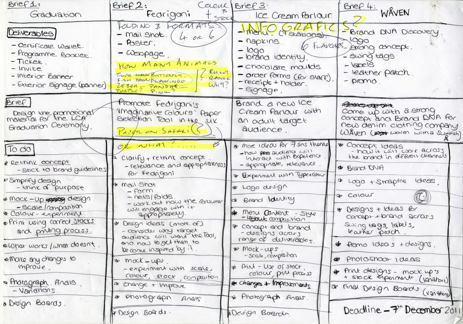
OUGD301 - To do
Following the crit on Thursday, I have re-thought each brief, and clarified the deliverables and coem up with a to do list for each brief. I will create a much more detailed version for each brief as I work on them, this gives an overall view of what do do, and where abouts I am at the moment.

Friday, 18 November 2011
Subscribe to:
Posts (Atom)