Showing posts with label Brief 2. Show all posts
Showing posts with label Brief 2. Show all posts
Tuesday, 13 December 2011

Brief 2 - Finals - photography
Here are the photographs of my mail shot and magazine promo for my design boards:
Sunday, 11 December 2011
Brief 3 - Final Menu Design
The menu would be printed double sided on 260gsm matt.
-Full size: A4
-Letter fold
-Digital print
-Red foil block - logo
-Full size: A4
-Letter fold
-Digital print
-Red foil block - logo
Friday, 9 December 2011
Brief 2 - Web Page design
The website page is the contact point for the consumer to order their very own Imaginative Colour paper Selection tool. This must be the most informative. I used the black card as a backdrop for the webpage and working with a 800px x 600px, I worked out that there should be 6 pages
1. About
2. Warm Book
3. Neutral Warm Book
4. Cool Book
5. Neutral Cool
6. Order
I used the animal stencil so that on the home page all the gradients are shown behind the animals, but then once you click onto their individual page, only their gradient is shown and the rest of the animals are white. I also have rollover buttons on the pages so that the text underlines. The animals on the web page have been cut into circles, to reduce the size. The deign has been kept simple and easy to use, and more information about each booklet would be included.
I tried some compositions before deciding on the one that worked best:
1. About
2. Warm Book
3. Neutral Warm Book
4. Cool Book
5. Neutral Cool
6. Order
I used the animal stencil so that on the home page all the gradients are shown behind the animals, but then once you click onto their individual page, only their gradient is shown and the rest of the animals are white. I also have rollover buttons on the pages so that the text underlines. The animals on the web page have been cut into circles, to reduce the size. The deign has been kept simple and easy to use, and more information about each booklet would be included.
I tried some compositions before deciding on the one that worked best:
Thursday, 8 December 2011
Brief 2 - Magazine Promotion
I want to use the animal stencil and the colour gradients across all media to keep the concept consist. However I will do so in different ways.
For the magazine promo, I want 4 posters (one for each book) that work as a set. The designs have a bit less information than the mail outs - so they have more impact - yet they still direct the consumer to the web page where they can purchase a tool. It is important that the paper medium is used within the design and so it is not just purely digital, as fedrigoni is a paper manufacturer and they want to keep this medium alive. So Instead of using a flat black colour I used a black card texture, and with the stencils I cut through this and did bait of Photoshop to make create a bit of depth within the cut outs. The gradients cover the background and work nicely around the edges of the paper too, making it stand out more as paper. This could have been laser cut and photographed but it was less time consuming to mock up, and it still works well. The rest of the type is in in white to stand out from the black. I think the posters look professional and promote the Fedrigoni tool well.
For the magazine promo, I want 4 posters (one for each book) that work as a set. The designs have a bit less information than the mail outs - so they have more impact - yet they still direct the consumer to the web page where they can purchase a tool. It is important that the paper medium is used within the design and so it is not just purely digital, as fedrigoni is a paper manufacturer and they want to keep this medium alive. So Instead of using a flat black colour I used a black card texture, and with the stencils I cut through this and did bait of Photoshop to make create a bit of depth within the cut outs. The gradients cover the background and work nicely around the edges of the paper too, making it stand out more as paper. This could have been laser cut and photographed but it was less time consuming to mock up, and it still works well. The rest of the type is in in white to stand out from the black. I think the posters look professional and promote the Fedrigoni tool well.
Open publication - Free publishing - More magazine
The slack card texture used:

The posters will be A4 size, so I will photograph them on silk paper to get that glossy appearance in my photographs
The slack card texture used:

The posters will be A4 size, so I will photograph them on silk paper to get that glossy appearance in my photographs
Brief 2 - Mail Shot Design
After mocking up the mail shot I designed another that would be easier to work and looked better. I also altered the type so that it read across the cut and folds better. The reverse of the mail out has the gradients and colour information.
I prefer the animal faces rather than just the pattern as they are more striking and emotive.
I will use this as my final design. The blank space is where the laser cut stencil would be:
The stock I will use is 260gsm matt card, to give a stable and smooth effect. The black gives a sort of velvet texture to the stock once printed, but this scratches easily so I will have to take care.
Here is the stencils for the laser cutter:

I prefer the animal faces rather than just the pattern as they are more striking and emotive.
I will use this as my final design. The blank space is where the laser cut stencil would be:
The stock I will use is 260gsm matt card, to give a stable and smooth effect. The black gives a sort of velvet texture to the stock once printed, but this scratches easily so I will have to take care.
Here is the stencils for the laser cutter:

Menu design
The menu embraces the whole Devilicious experience. From each of the seven stages, an item is picked to add to the sundae. These stages are: forbidden fruit, indulgent ice-cream, sinful shot, saucy sauce, immoral mixer, squirty cream and the finishing touch. The consumer is also offered the choice to add extra options to their sundae, meaning there is no limit to their indulgence.
Here are some designs I cam cup with to represent the 7 stages. I tried to make them seem less confusing and easy to understand.
I then experimented with using the shapes and style from the logo to keep the consistency:
Brief 2 - Web Banner design
To promote the tool on the Fedrigoni, The best way was to use a banner that they can click on to direct them straight to. This format is is a strip so I used the existing Fedrigoni webpage and replaced the banner with my own design.
Tuesday, 6 December 2011
Brief 2 - Gradients
The gradients for each colour book used with the animal stencils. I think these work really well. I prefer the second tiger image. However I will experiment with it in context to see which suits.
Brief 2 - Animal Stencils
I chose the most striking images of the animals from off my context blog, traced them and scanned them in and made them into vector images.
I did this for the animals:
And the patterns:
Even though the patterns are strong enough to hold the concept I think the animal faces are the most effective but I will try them both in the mail shot and see which is the strongest.
I did this for the animals:
And the patterns:
Even though the patterns are strong enough to hold the concept I think the animal faces are the most effective but I will try them both in the mail shot and see which is the strongest.
Brief 2 - Mock-up mail shot
Here is the mail shot I initially made, which I can adapt to make it's purpose more clear. The text written across the outer cover of the mailer could be quite confusion as it means they would have to turn it around and then they wouldn't' know which bit to open next. It would be better then if the Logo was just kept on the front with the Gone Wild strap line. This would make them read it as a book and open it the way it should. The next opening should contain information about the tool, and direct them to there they can get there own (making it clear that the mail out is not the tool itself). Then the inside pages would have the 4 animals with the gradients behind. I think adding some information about the gradients on the reverse would be a good ideas to give the consumer more information about them.
I also tried different scales. I prefer the design on A2 as it had more about it, and isn't as flimsy. It would also allow the animal stencils to be more detailed.


I also tried different scales. I prefer the design on A2 as it had more about it, and isn't as flimsy. It would also allow the animal stencils to be more detailed.


Brief 2 - Language
After thinking about the language used to explain the tool, that refers to using your animal instincts I decided on this:
Get your claws into the Imaginative Colours Paper Selection Tool, now available at Fedrigoni, and release your own imagination into the wild.
The tool consists of four distinctive booklets, divided into sections of warm, cool and neutral coloured Fedrigoni papers, that’s so easy to use, it must be in our DNA.
Brief 2 - Concept and Design ideas
After speaking with Lorenzo in the progress surgery, I still needed to strengthen my animal concept, and I thought about explaining this as having it in our DNA. The tool will be second nature to the consumer as it is so easy to use, the ideas of it already being in our DNA and that using the tool is like using your animal instincts. From this I thought the strap lien Fedrigoni Gone Wild, would be great to use as it refers to the wild animals, and also letting your imagination go into the wild with these imaginative colours. I also needed to re-think about the language used in the designs as in the mail shot it wasn't clear that the tool is something that you can order - it looked as if the mail shot was the tool as it did not direct them to where they could get it from themselves.
I tried a clever way of connecting Fedrigoni Gone Wild --- Fedrigone wild
However this may be confusing to the consume, so may be best to leave it seperate.

I also thought about how the idea of DNA could be used within the design. The structure of DNA itself is quite interesting and gives a scientific feel to the work - this works well as Fedrigoni have been refining the science behind creating their beautiful papers.


I tried a clever way of connecting Fedrigoni Gone Wild --- Fedrigone wild
However this may be confusing to the consume, so may be best to leave it seperate.

I also thought about how the idea of DNA could be used within the design. The structure of DNA itself is quite interesting and gives a scientific feel to the work - this works well as Fedrigoni have been refining the science behind creating their beautiful papers.


Each book could have it's own DNA in a different colour, or with a gradient of their colours.
Friday, 2 December 2011
Brief 2 - Concept and Design ideas
After speaking with Lorenzo in the progress surgery, I still needed to strengthen my animal concept, and I thought about explaining this as having it in our DNA. The tool will be second nature to the consumer as it is so easy to use, the ideas of it already being in our DNA and that using the tool is like using your animal instincts. From this I thought the strap lien Fedrigoni Gone Wild, would be great to use as it refers to the wild animals, and also letting your imagination go into the wild with these imaginative colours. I also needed to re-think about the language used in the designs as in the mail shot it wasn't clear that the tool is something that you can order - it looked as if the mail shot was the tool as it did not direct them to where they could get it from themselves.
I tried a clever way of connecting Fedrigoni Gone Wild --- Fedrigone wild
However this may be confusing to the consume, so may be best to leave it seperate.
I also thought about how the idea of DNA could be used within the design. The structure of DNA itself is quite interesting and gives a scientific feel to the work - this works well as Fedrigoni have been refining the science behind creating their beautiful papers.
I tried a clever way of connecting Fedrigoni Gone Wild --- Fedrigone wild
However this may be confusing to the consume, so may be best to leave it seperate.
I also thought about how the idea of DNA could be used within the design. The structure of DNA itself is quite interesting and gives a scientific feel to the work - this works well as Fedrigoni have been refining the science behind creating their beautiful papers.
Thursday, 1 December 2011
Progress Surgery with Lorenzo
here is some feedback and some things I need to clarify as taken from the progress surgery I had today with Lorenzo.
Final Design Boards
- should link any gaps - smooth story of brief
-full range shot
-photograph in context where possible
Brief 2 - I tried to mainly foci on this brief as it was th even I was most struggling with making the concept clear enough. So I need to :
- clarify why stencils are begin used
-work out mail shot and who the consumer interacts with it - what information needs to be included
-work in the language used to strengthen then concept - 'use your instincts'
- Fedrigoni wild is in our DNA
Brief 4 - WAVEN - I was taking ages in creating the logo for this, so I need to focus it down to one and see how far I could develop it so it looked right for the brand, as I had too many ideas.
- I decided to go with the idea of have a thread through the 'o' at the top of the Swedish A to bring the weaving process into the logo design.
Brief 4 - WAVEN - I was taking ages in creating the logo for this, so I need to focus it down to one and see how far I could develop it so it looked right for the brand, as I had too many ideas.
- I decided to go with the idea of have a thread through the 'o' at the top of the Swedish A to bring the weaving process into the logo design.
Wednesday, 30 November 2011
Brief 2 - Logo
Experimenting with some different typefaces for the strap line, to work with the Fedrigoni logo


This logo below uses a typeface for the strap lien that is similar to a typeface they use for their own marketing material, so it creates consistency one the brand. I don't like it as a strap lien however I think it may look better as body text for the paper selection tool info.


I prefer his bottom logo as it is clear and simple and bold. It doesn't give too much away so creates a sense of mystery to the design.
Tuesday, 29 November 2011
Brief 2 - Fedrigoni - Mail Shot

Still using the animals I tried to come up with a more solid concept. I looked into different combinations of animals and how each of them could represent the books, either through their colour or personality. And then whether they war animals from a specific place e.g. zoo, wild, sea, aquarium. I really like the wild animals and the idea that Fedrigoni has gone wild with the Imaginative colours tool.

I narrowed my animals down to 4 - one for each book.
The tiger would be used for the warm book representing the colours of red/orange/yellow
The Peacock would be used for the cool book representing the colours of green/blue/purple
The Giraffe would be used for the neutral warm book representing the colours of brown/beige/cream
The zebra would be used for the neutral cool book representing the colours of black/grey/white.
I thought about how this could be used for the mail shot. using just one main colour from each animal and using it with black and white which the animals could stencil into, so the consumer could interact and move the stencils over the colours.
Or all the colours for each book could be used as a gradient with stencil of their animal over them to represent the array of colours for that particular book. - I like this idea and feel it has potential.
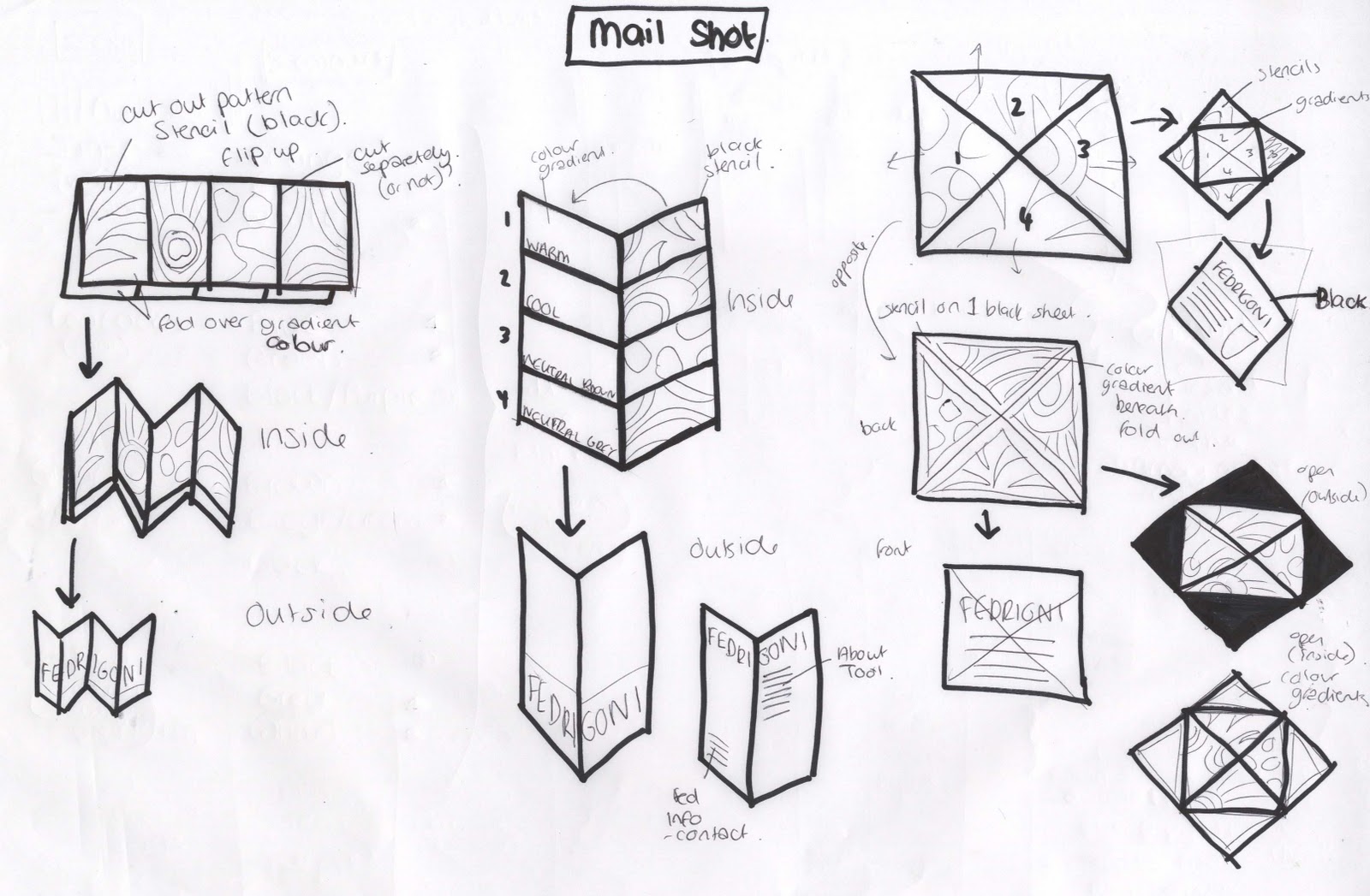
I really like the poster wrap idea shown below. As there are a few pages to work with before reaching the inside of the mail shot. These could all hold different sections of information about the tool and lead the consumer into the mail shot. The wrap cold have a slide out poster containing gradients of the colour, which could be seen throughout he stencil of the animal cut into the mail shot poster wrap, and then once it is taken out, can have information about each book.


The idea of it begin a Fedrigoni zoo, since I am using the animals. I tried to think o fsoem wording to make this concept stronger.

The webpage needs to be the contact point for the customer and a place where they can find out more about the tool, and order their own. design for the webpage could have a zoo style with the animal coming out of grass, or even using a map of a zoo in the background that once you click on an area of the map for an animal, it takes you to that colour book.

The magazine needs to represent the tool and inspire the target audience to want to have their own. I think having 4 posters - one for each book- would work the best as they could work consecutively one after the other. The information included needs to direct the audience to the web page were they can find out more about the tool. I think the language used for this will be very important in attracting the consumer.

I really like the poster wrap idea and feel it has the most potential so I worked out how the dsing will work across an A2 sheet of paper...

Mail Shot:
Poster Wrap Design:
I then mocked this up and got it printed to see how it works, and how the consumer can interact with it. I like this idea but it needs a few tweaks and some more information included.

Sunday, 20 November 2011
OUGD301 - Brief 2 - Fedrigoni
Taking the Fedrigoni brief back to the start - I tried to re-focus the direction of which I need to go in, as I hadn't worked out how the mail shot would work and how th consumer would interact with it. I just seemed to have the animal idea and wanted to make something out of it - this was a wrong root to take and also was time consuming.
The designs for the animals seem to be too random, so creating a more focused approach will help to solve the brief appropriately
Here are some things I need to take into consideration:

The designs for the animals seem to be too random, so creating a more focused approach will help to solve the brief appropriately
Here are some things I need to take into consideration:

Saturday, 19 November 2011
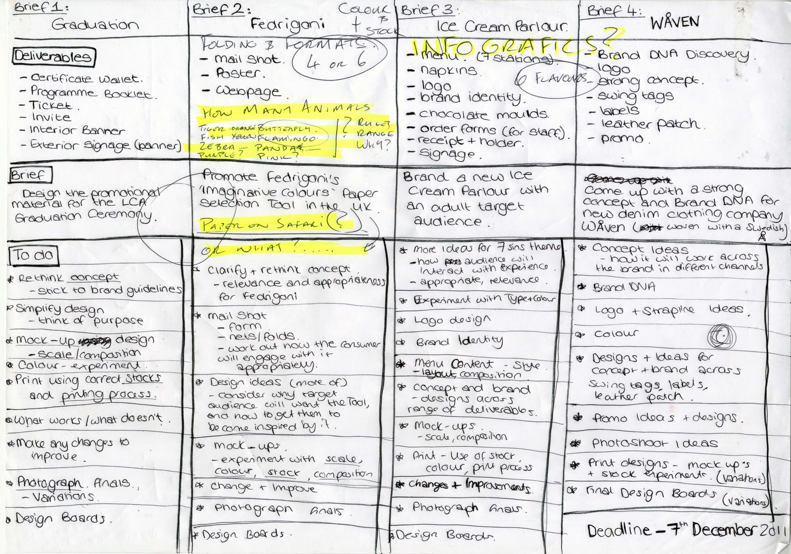
OUGD301 - To do
Following the crit on Thursday, I have re-thought each brief, and clarified the deliverables and coem up with a to do list for each brief. I will create a much more detailed version for each brief as I work on them, this gives an overall view of what do do, and where abouts I am at the moment.

Subscribe to:
Posts (Atom)