Monday 31 October 2011

Brief 3 - Design Concept Ideas

After coming up with some names for the Ice Cream Parlour I liked the name 'Devilicious' which is devil and delicious combined - this reflects the delicious ice cream that is an indulgence and worth risking temptation for. When taking delicious from the name 'DEVILICIOUS' the 'VI' are left over. These can be seen as roman numerals for '6'. Somehow having VII (7) could be worked into it incorporating the 7 deadly sins. The stations of making your personalised ice cream could be in 7 stations - representing the 7 deadly sins of  gluttony, greed, lust, sloth, envy, pride, anger.

Lust - Dust, must (dust - topping. must - ice cream flavour)
Pride - Side, tried (mix in - topping)
Greed - Seed, succeed (fruit choice)
Envy - Bevvy (alcohol choice)
Gluttony - Purity (sauce)
Sloth - Growth (how many scoops)

Colour representation of each sin:


Some quick logo ideas trying to make the 7 in roman numerals stand out. However I don't think it is working yet...


Brief 1 - Graduation - Venue Dressing


Here are the typical specifications for an exhibition roll up banner:

Size:  850mm x 2000mm
Stock:  Heavyweight 600gsm blockout PVC, waterproof, UV stable, class B1 fire certification
Printing Process:  Environmentally-friendly UV print process, no solvent used in print process, recyclable base.

And some designs for the banner:

Wednesday 26 October 2011

Brief 3 - Ice Cream Parlour Logo Ideas

Here are some designs I was experimenting with using the letters to make ice cream cones


Friday 21 October 2011

Brief 1 - Design ideas - Begin Concept

Here are some ideas I had for the 'Begin' concept for the LCA Graduation Design:

Signage - banner ideas for interior venue dressing


Ideas for Wallet


Thursday 20 October 2011

Brief 1 Concept imagery - It's time to fly

Thinking of graduation as the beginning, and that it could be represented by wings, as in it is time to fly. I tried to imagine who this could work across the range.


Tuesday 18 October 2011

Concept Idea - 'Graduation is The Beginning'

Graduation is not the end; it's the beginning.

I came up with a concept to focus Graduation as an event that should be marked as 'The Beginning'. Although it also marks the end of your time at LCA, and is a time of celebration for all the hard work and effort put into achieveing a degree. It is also a time to look to the future. It is the beginning. 

Here I have mind mapped some ideas about Graduation being the beginning:


 I like that within the phrase - 'Graduation is the beginning' can be picked out, so I came up with some ideas on how this could be incorporated considering print. Where you see part of the phrase on the front throuh dye cut 'holes', and then when the page is turned you can read the whole phrase.

I looked at how this idea could work across the range. I don't want to have the same thing slapped across each designed piece, so here I came up with how each would be different and relevant to the design in it's own context.


I then looked what 'beginning' means, to try and come up with some ideas for visuals and ideas.
I also thought about using quotes form successful people, to inspire graduates in beginning their journey in the real world, so I looked at quotes that are relevant to this.

Quotes

Here are some inspiring quotes that I have gathered and categorised.

The idea of using quotes is that they will inspire graduates, ease their nerves and give them guidance.


Open publication - Free publishing - More inspiration


Experimenting with scale, compositions, typeface, weight:


Monday 17 October 2011

Concept Statement - LCA Graduation Design - Brief 1

Event Information

Composition and Hierarchy of the Event information.

Brief 1 - Graduation Invite Ideas

Some ideas for the invite - experimenting with colour and composition:


Friday 14 October 2011

Concept Ideas

I wanted to look into different concepts, so I could explore different directions, so here I started with the use of the laurel leaves.

Laurel Leaves-
The use of the laurel leaves for Graduation, are reflective of what they stand for. They represent honour and achievement of which is appropriate and relevant to this event. It can give a sense of class and prestige.


Proud Parents - It's their day really
The idea that Graduation means more and is more important to them than the actual student.
Although they are proud of their child, they are more proud to have a child that is a Graduate.
The language used would be more directed to them, and be quite boastful (e.g. My child's a graduate)
It would be more considerate of their emotions on the day, rather than that of the student.
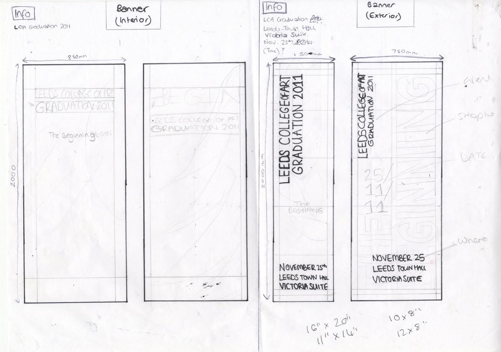
Leeds Town Hall
The location/venue of the Ceremony being the main focus.
Visuals such as the pillars, and shape of the town hall, along with it grandeur and prestige hall would be used within the design to reflect the Graduation.

Success of Previous Graduates
Using the success of previous Graduates such as Henry Moore, Damien Hirst and Neville Brody, to inspire the students and make them understand and think about what they could achieve themselves. Sort of following in their footsteps. 

Ribbon and Scroll
The main thing that you receive on the day is what it is all about. It is precious and the main focus. This would be used as a visual for Graduation, however I think this could be quite corny and obvious.

Time of Year
Graduation is in November, so use the time as a focal point for Design. It is Autumn/Winter so could be reflected in visuals and colour schemes.

The throwing of the Cap
The cap and gown is worn for graduation so is a strong relevant visual which could be the focal point of the design. After receiving the certificate graduates throw their caps into the air as a celebration. The designs could be inviting student to 'come throw your cap', and signage to show 'this way to throw your cap'.

Creativity
LCA is all about creativity. To reflect the ideas and creativity from the time at LCA, drawings and paints splatters and lines, and type made out of paint, in a messy creative way. To show that initial start to coming up with ideas. Imagination is not organised it is all over the place, and the 'mess' reflects this. Colour would be used to reflect the array of ideas, over a crisp clean white background representing starting off with a blank canvas. Colour Blocks of information could then be used to make it stand out.

Quotes
Using inspirational quotes from successful people as a guidance for students. This would be mainly typographic.

Newspaper Style
Headings, text columns and image in the style of newspaper. Graduation being the headliner.

Film Ad
An idea that the Graduates are 'Coming Soon', as the new talent will emerge into industry. Could be a count down.


Colour

Through research I found some appropriate colours to use for the Graduation design. 

Gold evokes the feeling of prestige. The meaning of gold is illumination, wisdom, and wealth. Gold often symbolizes high quality.
Light yellow is associated with intellect, freshness, and joy.
Dark blue represents knowledge, power, integrity, and seriousness.
White is associated with light, goodness, innocence, purity, and virginity. It is considered to be the color of perfection.
Black is associated with power, elegance, formality, death, evil, and mystery.


I was already considering using blue in the design, as they also reflect the colours of the LCA mosaic, but they also have associations with knowledge and integrity which is an appropriate representation for and educational institute.

Thursday 13 October 2011

Image

To come away from the Laurel Leaf idea, I came up with some visuals that represent and are associated with LCA and Graduation.


However, I find that these visuals are quite obvious and overused regarding Graduation, so using them would not be original and new.

Potential Range of Promotional Material


Here I have come up with different formats of which the branding can be applied.
From this I want to extend my range by including exterior signage (which promotes the event at the venue and also wayfinding to it), and also interior signage for dressing the venue, to get an overall feel for the ceremony.

Progress Surgery Feedback

Here are some notes and feedback I recieved from the progress crit with Lorenzo, and an action plan that I am going to follow.


We pin-pointed that for Brief 1 I had stuck with the Laurel Leaf idea and that looking at different concepts could help to come away from this and generate new ideas. This is what I want to do to broaden my development and come up with alternate design ideas that are more appropriate and that work better. I am also going design for more deliverables, considering the brand across a range of different medias. I need to look more into branding to help me gain a better understanding of it. So I will do some research on this.

I am also going to start on Brief 2 and 3 coming up with some initial ideas and concepts.

Wednesday 12 October 2011

Design Development

I printed off some of the Certificate wallet designs to see hwo they would work with the slot in ticket.

I also tried some embossing. I really like the subtleness off embossing, as it gives that touch of prestige.

Composition


Here are some different compositions of layouts. That take into consideration the pritn process, and embossing dye cutting.

Tuesday 11 October 2011

Graduation Design - Laurel Leaves


Playing around with the laurel leaf design and it's hierachy of information an proportion.
I also experiemented with font using the mandatory requirement of Clarendon and Helvetica in different weights.


Graduation - Certificate Wallet

Monday 10 October 2011

Graudtaion Certificate Wallet Ideas

Wallet ideas - ticket and certificate holder slots


 Ticket Shape:


 I was thinking about how the designs woudl look as a set and came across some ideas that could work really well.
This first drawing shows that the laurel leaf will be split in half to cover the front and back of the wallet and programme booklet so that when it is open flat the design is visible. The ticket would have the whole laurel leaf design.
I then thought that the laurel leaf design could be printed across all the separate pieces (wallet, ticket, programme) like a jigsaw. I mocked up what this could look like taking scale into consideration.
Another idea shown shows the idea of a finishing line across the 'assets', this represents the end of the 'race', a sign of the end your time at LCA.

 Drawing to 2:1 scale

Information to Include

Certificate Wallet
-Logo
-Graduation - or some form of representation of

Ticket
-Ticket
-LCA
-Graduation year
Ticket - with Ceremony Information
-Student Name
-Course of Study
-LCA
-Graduation year - Class of '2011'
-Ceremony Information

Invitation
-Student Name
-LCA
-Graduation year - Class of '2011'
- plus 2 complimentary quests
-Date of Ceremony
-Venue of Ceremony
-Time
-Information - arrival, gowns

Programme Booklet
Cover-
-LCA
-Graduation year
-'Programme'
Inside-
-Order of ceremony - times, info
-Principal's Welcome
-Bio of Key Note Speaker
-Student Achievements
-Awards - Each Course
-The Alumni Society

Friday 7 October 2011


Another idea I had was to create the laurel leaves design in a mosaic style, as a reflection of the LCA mosaic.


Or another idea was to create a laurel typeface...

Graduation Invitation

I played around with using colour first on a layout for the invitation. I think the gold metallic on CMYK gold will be quite subtle, but maybe the darker colours work better. I experimented with some of the colours from the mosaic. I also used a shaded blue over the blue background, this is to represent and emboss or deboss of the laurel leaf:


Composition

Laurel Leaves

To get the wreath symmetrical I cut and reflected half of the image
I then played around with the strokes using a milter join and round join on the corners. I prefer the round corners.
I also used a metallic pantone colour in a gold shade.

Colour

Here are some colours I cherry picked from the LCA mosaic logo, that could be used within my designs:


A scarlet red colour was used for the previous promotional material, so I would like to use something different.

I like some of the blues and also they yellow core/gold colours as they give a feel of luxury and prestige.

Wednesday 5 October 2011

Graduation Ideas


Working with the shapes of the laurel leaves and creation pyramid shapes to represent them being at graduation being at the top.


Laurel Leaves

I found that the Laurel Leaves are used within the LCA mosaic that represents the College.
These leaves are recognised as a symbol of achievement, which makes them relative for graduation and also for LCA.
For the previous promotional designs a felt they were lacking a visual element and this could be it, even if just on a small scale.
I have drawn a few laurel wreaths that could be used within my promotional material.


For the research click Here

Vectoroised:
I scanned in my drawing and live traces them in Illustrator.
I changed the threshold of these 4 laurel leaves to see if there was much difference in the pattern.

I found that the ones with a higher threshold were more suitable, because you can still define the leaves:


Using this design idea within composition:

Tuesday 4 October 2011

Brief 1 - Concept Design Ideas

Here are some designs for the concept of having Graduation represent the creativity of the graduands time at LCA. The design consists of a blank white canvas with paint splatters and lines that represent the creative freedom and expressiveness that students are allowed when exploring who they are as designers and artists.

The image I have borrowed off the internet just top show what it would look like:


I think these are good visuals and represent 'art'. I could even try writing with paint, or drawing a particular image.

Graduation Ceremony Ideas

Organising my thoughts and some important considerations about LCA Graduation, pointing things out about Leeds Town Hall, Promotional Material, Target Audience, Graduation and Leeds College of Art:


Focusing on what Graduation is all about, including what it really means to people (e.g. celebration, reward at the end of the tunnel, and end of an era), and is a reminder for their experiences at college for years to come.


Promotional Material considerations - looking at what imagery could be used to represent graduation.

It is important to realise that the promotional material is going to be a keepsake and that the graduates will keep them to remind them of their time at LCA and as recognition of their achievements. This means it needs to be special and important, and also sustainable: