Showing posts with label Brief 3. Show all posts
Showing posts with label Brief 3. Show all posts
Tuesday, 13 December 2011

Monday, 12 December 2011
Brief 3 - Final Designs Photography
Shows the final design for the logo, menu, letterhead, business card and exterior signage of Devilicious.
Sunday, 11 December 2011
Brief 3 - Final Menu Design
The menu would be printed double sided on 260gsm matt.
-Full size: A4
-Letter fold
-Digital print
-Red foil block - logo
-Full size: A4
-Letter fold
-Digital print
-Red foil block - logo
Brief 3 - Exterior Signage
This is how the exterior of the Lounge would appear, with the logo printed on the glass window and with horizontal type across the top.


Saturday, 10 December 2011
Brief 3 - Letter Head design
I tried a few compositions with the logo central and on the left hand top corner, I feel the latter worked the best. And I also had the contact of information at the bottom of the page as it felt too cluttered under the decorative logo.
The logo also worked better in red than black.
The design of the business card follows through to the letter head, which also has a foil block on the reverse, to make it unique and memorable. The logo is kept in the top right hand corner with the contact detail at the bottom of the page.
The logo also worked better in red than black.
The design of the business card follows through to the letter head, which also has a foil block on the reverse, to make it unique and memorable. The logo is kept in the top right hand corner with the contact detail at the bottom of the page.
Friday, 9 December 2011
Brief 3 - Business Card
I decided to use the red logo design on a white background with the text in a dark red, this I feel is the most suitable and most striking.
The business card is a point of contact for the consumer, and for them to take as a reminder of their experience at Devilicious. To give a feel of unique and luxury, the logo is printed alone on the front, and on the back is the contact details reversed out of red foil block.
The back of the business card is printed black so I can foil the reverse side.
The scale of the business card is 55mm x 85mm.
Here is a multiples document that would be used to print double sided
Thursday, 8 December 2011
Brief 3- Menu design
The menu embraces the whole Devilicious experience. From each of the seven stages, an item is picked to add to the sundae. These stages are: forbidden fruit, indulgent ice-cream, sinful shot, saucy sauce, immoral mixer, squirty cream and the finishing touch. The consumer is also offered the choice to add extra options to their sundae, meaning there is no limit to their indulgence.
Here are some designs I cam cup with to represent the 7 stages. I tried to make them seem less confusing and easy to understand.
I then experimented with using the shapes and style from the logo to keep the consistency:
I like the symmetrical design at the top and the bottom the most, they look very professional and in keeping with the logo design
I like the symmetrical design at the top and the bottom the most, they look very professional and in keeping with the logo design
Friday, 25 November 2011
Brief 3 - Ice Cream Parlour - Logo Design Ideas
The design for the logo with trying to make the VII stand out weren't working as well as I'd like them to. So I thought I'd try a different style, by taking influence from iron gates. These would be used to symbolise the 'gates of hell', but also have a decorative appearance which gives a stylish, classy, sophisticated touch with just a bit of mystery.
.
.
The typeface used is Caudex, which is a formal serif font with an edge. It perfectly suits the style of the Lounge.
I used a black, white, grey and red colour scheme as this is a strong stereotype for the devil
The colour scheme is stereotypical and uses bold shades of red, black and white, as they are relative to the sins such as ‘anger’, ‘passion’ and ‘lust’.
Monday, 21 November 2011
OUGD301 - Brief 3 - Ice Cream
With this brief I have taken a step back to think about the experience the audience will have at the Ice Cream parlour:

I also began to compile the menu - with a limit of 6 flavours for each station. To stay with the Devilicious theme, I experimented with the words to make them sound more naughty. This appeals to the target audience as it is fun.

I then narrowed down the choices for each station:

The menu will work in 7 stations where a choice will be made from each one to create the perfect ice-cream. Here I began to think of what this could look like in terms of the menu, and the staff order form, to make it as simple as possible:

I then thougth of the format of the menu, with different folds and ways of interacting with it. It is very important to make this as clear as possible and eliminate any confusion. Information graphics will play the biggest part in this, so experimenting with type, image and composition is what I need to do next.


Saturday, 19 November 2011
OUGD301 - To do
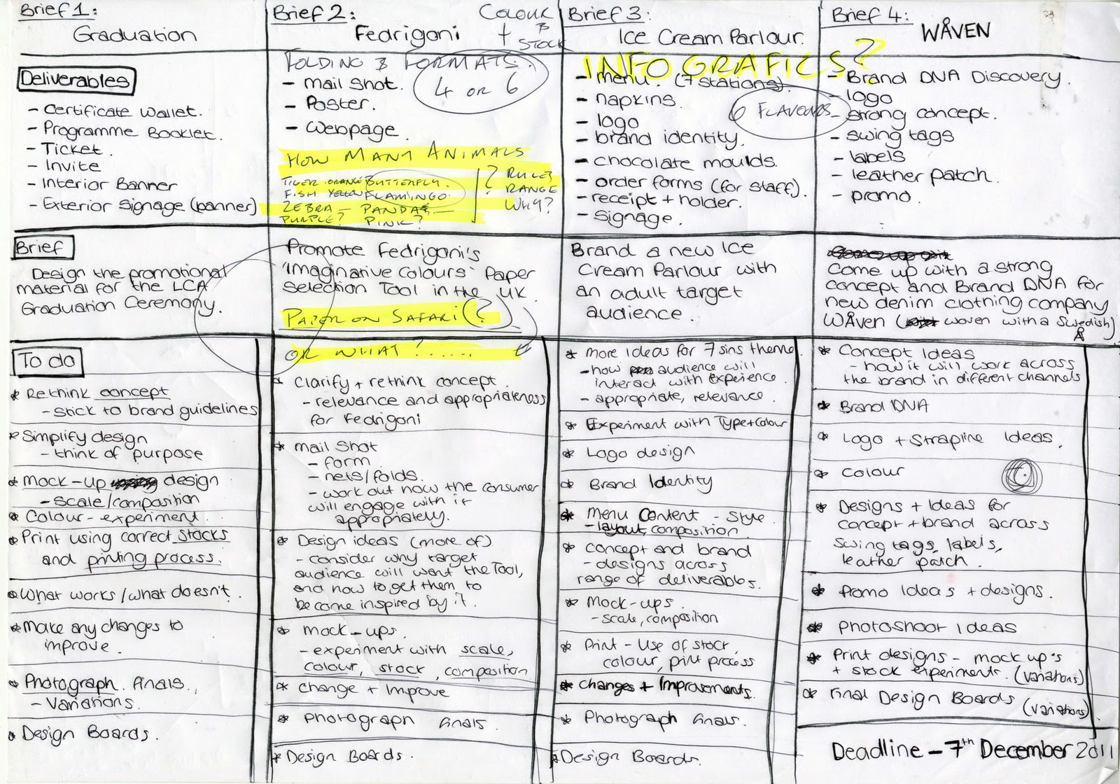
Following the crit on Thursday, I have re-thought each brief, and clarified the deliverables and coem up with a to do list for each brief. I will create a much more detailed version for each brief as I work on them, this gives an overall view of what do do, and where abouts I am at the moment.

Friday, 18 November 2011
Wednesday, 16 November 2011
Brief 3 - Sundae's


Soem imagery that could be used for the sundae's, however i think this would be more aimed towards a young target audience due to the cartoon style.
Tuesday, 15 November 2011
Brief 3 - Ice Cream Parlour - Stencils

A mixture of some of the stencils that represent each sin 'station'.


Tuesday, 8 November 2011

Thursday, 3 November 2011
OUGD301 - Brief 3 - Ice Cream Parolour Location Imagery
Looking where the Ice Cream Parlour could be situated I thought it would be better among the high class restaurants and bars, in a prime spot to reach the target audience. The place itself must look classy and have a modern luxurious feel to it.
Here are some imagery of where it could be:
Here are some imagery of where it could be:
Monday, 31 October 2011
Brief 3 - Design Concept Ideas
After coming up with some names for the Ice Cream Parlour I liked the name 'Devilicious' which is devil and delicious combined - this reflects the delicious ice cream that is an indulgence and worth risking temptation for. When taking delicious from the name 'DEVILICIOUS' the 'VI' are left over. These can be seen as roman numerals for '6'. Somehow having VII (7) could be worked into it incorporating the 7 deadly sins. The stations of making your personalised ice cream could be in 7 stations - representing the 7 deadly sins of gluttony, greed, lust, sloth, envy, pride, anger.
Lust - Dust, must (dust - topping. must - ice cream flavour)
Pride - Side, tried (mix in - topping)
Greed - Seed, succeed (fruit choice)
Envy - Bevvy (alcohol choice)
Gluttony - Purity (sauce)
Sloth - Growth (how many scoops)
Colour representation of each sin:


Lust - Dust, must (dust - topping. must - ice cream flavour)
Pride - Side, tried (mix in - topping)
Greed - Seed, succeed (fruit choice)
Envy - Bevvy (alcohol choice)
Gluttony - Purity (sauce)
Sloth - Growth (how many scoops)
Colour representation of each sin:


Some quick logo ideas trying to make the 7 in roman numerals stand out. However I don't think it is working yet...


Wednesday, 26 October 2011
Brief 3 - Ice Cream Parlour Logo Ideas
Here are some designs I was experimenting with using the letters to make ice cream cones
Wednesday, 19 October 2011
Subscribe to:
Posts (Atom)