Throughout this module I feel I have learnt alot about my own design practice. I enjoyed collaborating for the YCN brief and found that between us, our workload increased dramatically to what would have been if we were alone. However, compromise was a big part of this, and when it came to Product - Range - Distribution brief, I then felt I had the freedom to explore my own creative interests. I enjoyed the Design for Web brief, as I have never done this before, and it now gives me another area of Graphic Design to develop my skills in further.
Through the duration of the briefs I have realised I spend far too much time at the behinning doing all the research, and then not having as much time to design. I have spotted this as something to consider, as starting the design work earlier will allow me more time to develop and push my work to its full potential. However, it is still important to research to allow myself to make informed decisions.
I have really enjoyed designing logos, and brand identitys in this module, and would like to expand on this within third year. Managing my time is also something I need to think about further in third year, so I can make the most of my time designing, and not squander it away.
One thing I have noticed as a weakness in my design work is that I tend to prioritise which idea I think has the most potential, and don't explore the other ideas as in depth. I realise that I should make sure I exhaust every direction to see which styles and outcomes I could end up with, because I could surprise myself and end up with totally different, more effective outcomes.
Thinking of what I would do differently, I will definately start designing earlier in the next brief, to allow myself more time for development. I need to stop staying safe with my ideas, and come up with some really clever, intriguing concepts that I am proud of. I have kept on top of my blog in this module, and will carry on doing so. And also I will make sure that when it comes to crits, that I bring enough work and make sure it is clear with the ideas/concept I am trying to get across, and ask what I need to know about my design work and how it could be improved. This will ensure I come away more benefited with help toward my design development.
Attendane - 4
Punctuality - 3
Motivation - 5
Commitment - 5
Quantity of work produced - 4
Quality of work produced - 4
Contribution to the group - 4
Friday 27 May 2011


Thursday 26 May 2011


Wednesday 25 May 2011
Final Product/Range/Distribution
Logo:
Pantone colour - 234 M

Range of products ready for print:
Business card (inside and outside):
Size - 55mm x 170mm (55mm x 85mm each card)
Stock - Matt
Finish - Perforated
Receipt:
Size - 80mm (height determined by size of bill) for mock-up I've used 140mm height
Stock - 50gsm paper
Receipt holder (inside and outside):
Size - 100mm x 160mm
Stock - Matt
Finish - Die Cut
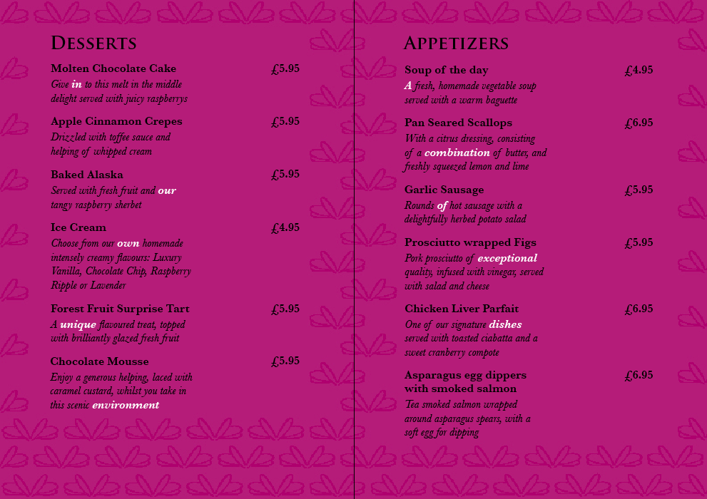
Menu pages:
8 pages over 2 sheets (double sided)
Spread Size - 180mm x 198mm
Stock - Matt
Menu cover proposal: (Front and Back)
Stock - Mahogany wood
Size (each piece) - 150mm x 293mm x 4mm
Finish - Lazer cut logo

Website pages:
800 x 600 px
Pantone colour - 234 M

Range of products ready for print:
Business card (inside and outside):
Size - 55mm x 170mm (55mm x 85mm each card)
Stock - Matt
Finish - Perforated
Receipt:
Size - 80mm (height determined by size of bill) for mock-up I've used 140mm height
Stock - 50gsm paper
Receipt holder (inside and outside):
Size - 100mm x 160mm
Stock - Matt
Finish - Die Cut
Menu pages:
8 pages over 2 sheets (double sided)
Spread Size - 180mm x 198mm
Stock - Matt
Menu cover proposal: (Front and Back)
Stock - Mahogany wood
Size (each piece) - 150mm x 293mm x 4mm
Finish - Lazer cut logo

800 x 600 px

Pantone
The Pantone reference number for the colour that I want to be printed: Solid Matte 234 M
However it does look a lot pinker and brighter on screen. So I will use the colour I have been using for my boards as they will be on screen.

However it does look a lot pinker and brighter on screen. So I will use the colour I have been using for my boards as they will be on screen.

Tuesday 24 May 2011
Firefly Website
The pages I am going to mock up are the Home Page, Book a Table, Customer Reviews and the Contact Page.
 Here is a mock up of the Home Page. In this design I used the fading pattern gradient rather than the large wing pattern. And some white space. I prefer this it has a more fresh look. I also added a rollover button, shown here on the Navigation on the Home Button, which changes from Black Regular Baskerville type, to White SemiBold Baskerville in a purple box with the wing pattern.

 This is the Customer Reviews page were they can enter their code from the business card, and receive their voucher. I have kept a simple grid to keep the process simple and clear. This allows them to select a rating for each. The rollover button is shown again on the 'Customer Review' Button.


I then created the same page with the split composition to keep to pages consistent. I think this will work better:

The online booking system uses 3 pages and you are directed through them whilst making a booking, The first page asks for the party size, date and time the customer would like to make a booking. The next page then offers availability on that date, and offers alternative times. The final page then asks for the customer details and booking confirmation
Page 1:


Page 2:


Page 3:


Contact Page:
This page includes the address, phone number, fax number, email, opening times, and a location map:

More Menu alterations
I changed the large wing pattern to the small background pattern to make the designs consistent.
Full pattern:


 Pattern removed behind the text:
This creates more clarity for reading.


After doing some print runs, I need to get out the pantone book to try and get the colour near as possible, at the moment it is coming out a muddy colour.
For the menu, the pantone colour seemd abit toodark after printing so I inversed the pattern so the backgroudn is the lighter 90% tint and the pattern is 100%. This makes it more legible. I have also worked out the pagination of the 8 pages. The menu will be printed using just two A4 sheets:
On the first sheet pages 8 and 1 will be on one side:
 With pages 2 and 7 on the other side
 And on the second sheet, pages 6 and 3 will be on one side:
 With pages 4 and 5 on the other side

Full pattern:


This creates more clarity for reading.


After doing some print runs, I need to get out the pantone book to try and get the colour near as possible, at the moment it is coming out a muddy colour.
For the menu, the pantone colour seemd abit toodark after printing so I inversed the pattern so the backgroudn is the lighter 90% tint and the pattern is 100%. This makes it more legible. I have also worked out the pagination of the 8 pages. The menu will be printed using just two A4 sheets:
On the first sheet pages 8 and 1 will be on one side:


10% Off Voucher
This is the voucher the customer will receive, via email, after they have entered their code and made a review online. All they need to do is print if off and bring it with them next time they visit Firefly.
I went for a slightly different feel, still using the pattern and logo and Baskerville typeface, but since it is an introductory offer I want it to be feel like a 'luxury gift' and be special. I have also used a gradient to emphasize this. With the customer printing it off themselves, the voucher won't be able to have an special print finishes.
Large wings:
 Wings pattern:


I went for a slightly different feel, still using the pattern and logo and Baskerville typeface, but since it is an introductory offer I want it to be feel like a 'luxury gift' and be special. I have also used a gradient to emphasize this. With the customer printing it off themselves, the voucher won't be able to have an special print finishes.
Large wings:


Larger wing pattern:
I think this works the best, and keeps the consistency within the range.

Receipt & Holder
I decided to extend my range by creating a receipt and holder. The design I used is similar to the business card, with the pattern. And will be able to slot the receipt inside by either a flap or some curved slits.

Receipt:

Holder:


Receipt:

Holder:

Final Crit Feedback
Here is the feedback I received in the final crit:


Action Plan:
I like the layout of the boards and they have proved to be clear and informative. However the only thing that needs changing is some of the imagery, which I will replace with photographs of the final products once I have printed them.
These are the main thing I need to work on with my designs:
-Change stroke on logo or change it all to white
-website -further development, to try with a clean fresh white backdrop with the wing pattern.
-web pages
-signage for outside the restaurant
-change type of 'Thank you' on the receipt holder
-menu graphics - change the large pattern to the small wing pattern
-print and photograph final product range
-experiment with foiling for business card, receipt holder and menu.
Subscribe to:
Posts (Atom)