Wednesday 30 November 2011

Brief 2 - Logo

Experimenting with some different typefaces for the strap line, to work with the Fedrigoni logo


This logo below uses a typeface for the strap lien that is similar to a typeface they use for their own marketing material, so it creates consistency one the brand. I don't like it as a strap lien however I think it may look better as body text for the paper selection tool info.

I prefer his bottom logo as it is clear and simple and bold. It doesn't give too much away so creates a sense of mystery to the design.

Brief 4 - WAVEN - Logo Typeface

Here are a few typefaces that I feel could reflect the brand. They are bold and clear:


These other typeface are still bold but have more to them in terms of being more visually interesting and they look less corporate:


I changed the A to the Swedish A and changed the kerning of the letters to make them more balanced. I feel these are more visually interesting than the arial typeface and have an edge to them.


Colour Schemes

I found these colour schemes on colour lover.com,

These relate to Sweden


These relate to denim and twill.

OUGD301 - Brief 4 - WAVEN - Logo

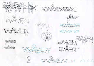
Working from the previous logo designs I did in Illustrator here are some more that cary on from these. I tried to make it look less corporate by experimenting with dash lines to represent stitch and make it appear to relate to denim bait more. I need to experiment with colour schemes and come away from this obvious blue and yellow, which I have just used to make the type and circle separate.


Open publication - Free publishing - More brand


After this I got told the logo with the A and the large circle looks like a ferris wheel! So that is not something I want the brand to be associated with so I have chosen to to use this. However I found this image of a piece of machinery used within the denim making process which has a look of it. Suppose it is something that could be associated with it, but I don't think it is obvious enough:

Brief 4 - Logo Design


Brief 4 - Swing Tag and Label


Tuesday 29 November 2011

Brief 1 - Photography of final prints

Some imagery that I will use or my design boards:


Brief 2 - Fedrigoni - Mail Shot

Still using the animals I tried to come up with a more solid concept. I looked into different combinations of animals and how each of them could represent the books, either through their colour or personality. And then whether they war animals from a specific place e.g. zoo, wild, sea, aquarium. I really like the wild animals and the idea that Fedrigoni has gone wild with the Imaginative colours tool.

I narrowed my animals down to 4 - one for each book. 
The tiger would be used for the warm book representing the colours of red/orange/yellow
The Peacock would be used for the cool book representing the colours of green/blue/purple
The Giraffe would be used for the neutral warm book representing the colours of brown/beige/cream
The zebra would be used for the neutral cool book representing the colours of black/grey/white.

I thought about how this could be used for the mail shot. using just one main colour from each animal and using it with black and white which the animals could stencil into, so the consumer could interact and move the stencils over the colours.

Or all the colours for each book could be used as a gradient with stencil of their animal over them to represent the array of colours for that particular book. - I like this idea and feel it has potential.

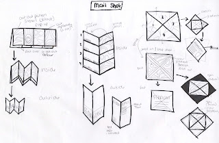
I looked into different format for the mail shot on how the 4 books could be incorporated through different folds.

I really like the poster wrap idea shown below. As there are a few pages to work with before reaching the inside of the mail shot. These could all hold different sections of information about the tool and lead the consumer into the mail shot. The wrap cold have a slide out poster containing gradients of the colour, which could be seen throughout he stencil of the animal cut into the mail shot poster wrap, and then once it is taken out, can have information about each book.

I think splitting the colour book into three main colours each would make the designs interesting and appealing. I thought how this could be used with the mail shot, maybe as a strip of gradient where the stencils can slide across or even as a colour wheel where the stencils can spin over the gradients. Just a few interactive ideas..

The idea of it begin a Fedrigoni zoo, since I am using the animals. I tried to think o fsoem wording to make this concept stronger.

The webpage needs to be the contact point for the customer and a place where they can find out more about the tool, and order their own. design for the webpage could have a zoo style with the animal coming out of grass, or even using a map of a zoo in the background that once you click on an area of the map for an animal, it takes you to that colour book.


The magazine needs to represent the tool and inspire the target audience to want to have their own. I think having 4 posters - one for each book- would work the best as they could work consecutively one after the other. The information included needs to direct the audience to the web page were they can find out more about the tool. I think the language used for this will be very important in attracting the consumer.


I really like the poster wrap idea and feel it has the most potential so I worked out how the dsing will work across an A2 sheet of paper...


Mail Shot:

Poster Wrap Design:
I then mocked this up and got it printed to see how it works, and how the consumer can interact with it. I like this idea but it needs a few tweaks and  some more information included.

Brief 2 - Ferigoni

Monday 28 November 2011

Brief 1 - Screen printing

I screen printed my designs onto a variety of different coloured blue card, and also tried it with the red to see if the blue looked better. I still preferred the bleu and felt it looked more suited to the event as it looked more formal and is a colour that represents achievement.


Friday 25 November 2011

Brief 3 - Ice Cream Parlour - Logo Design Ideas

The design for the logo with trying to make the VII stand out weren't working as well as I'd like them to. So I thought I'd try a different style, by taking influence from iron gates. These would be used to symbolise the 'gates of hell', but also have a decorative appearance which gives a stylish, classy, sophisticated touch with just a bit of mystery.


The typeface used is Caudex, which is a formal serif font with an edge. It perfectly suits the style of the Lounge.
I used a black, white, grey and red colour scheme as this is a strong stereotype for the devil
The colour scheme is stereotypical and uses bold shades of red, black and white, as they are relative to the sins such as ‘anger’, ‘passion’ and ‘lust’.

OUGD301 - Graduation - Setting up for print

I set my final designs up for print, using the colour separation for the 2 printing inks, and crop marks. The 2 ink used will be spot varnish and metallic silver.

The Ceremony Information Ticket:
I have fitted 6 tickets on one A2 page, which will mean I can manually screen print more tickets at once. This is better than using an A3 page which I could only fit 2 tickets on.
The tickets measures at 133 x 133mm


Graduation Ticket:
 Same as the Ceremony Info Ticket, I have fitted 6 of the Graduation Ticke's on an A2.
The ticket measures the same as the Ceremony Info ticket at 133 x 133mm


Certificate Wallet:
There is only ink being printed on the front of the certificate so I have created separations for just the front page, to make it easier for manually printing as it will take up less room on the screen. The front side fits onto an A3 sheet.
The whole size of the wallet measures 500 x 336mm, however the front side measures half the width so this is 250 x 336 mm


Ceremony Programme Cover:
Since the cover is only small I have decided to include the whole of the exterior cover, so it is easier to trim. This won't take up much room as it fits onto an A4 sheet.
The whole programme cover measure 280 x 148mm, and once folded measures 140 x 148mm


Thursday 24 November 2011

Brief one Venue Signage

With graduation being tomorrow (25/11/11) I think it would be a better idea to change the year on my designs to 2012, so they can be a pitch for next years promo material.


OUGD301 - wAven - Logo design ideas

I experimented with my logo ideas in illustrator so I could get theme more precise and experiment with colour more.

I tried to get the lines of the word WAVEN at the same angles, which meant putting the E and N on a slant. This I thought made the letters fit together better that they are a close nit 'weave'.


I played around with emphasising the circle of the Swedish A by using a larger circle in a different colour that intertwined with the letters an replaced the cross bar on the A. This I feel could work alone as a single logo, and could even work as a swing tag on the clothing. I really like the look of this and feel it could be recognisable as the WAVEN brand once the associations have been made. I need to experiment more with colour, and also with the typeface. I feel the logo as a whole is looking too corporate, however I think it needs to be kept quite simple and clear and not distracting or too busy. The blue used looks quite 'flat' and maybe using different colour schemes will develop this logo into something better.


OUGD301 - WAVEN - Story

I has some ideas for the story of the brand, bearing in mind a few things..

The target audience is:
-18 - 30 year old
-men and women
-contemporary dressed

The tone of voice used should be
-light hearted
-humourous?
-quirky


DNA Idea-
Similarly along the lines of Bluelood denim (indigo running through their veins), it could be that the consumer of the WAVEN brand has WAVEN woven into their DNA, or the jeans have WAVEN DNA. I thought about how the logo could be used alongside this working with the structure of DNA. The circle on the Swedish A acts as an addition to the DNA structure, which is something different to normal DNA. Personal unique things such as eye colour or fingerprints could be used within the logo to represent the WAVEN DNA as a more subtle side to the structure. Jeans = Genes


SWEDISH PRIDE Idea -
The idea that once you've tried them you'll never go back. A sort of spin off about sexuality and trying new things.
-Taking Gay Pride and having 'woven with Swedish Pride' as a tagline.
-The packaging design for the clothes could be about coming out of the closet, again referring to sexuality but with a different meaning as the clothes get taking out of the closet/wardrobe were they are stored to be worn.
-The subject is bit tongue in cheek as it is still bait of a taboo subject - and this can reflect the peculiarity of the Swedish A.

Brief 4 - WAVEN -Swedish Heritage

I researched into the country of Sweden to gather some more information about the type of country it is, and thought about how I could link the Swedish Heritage/Spirit. I have highlighted a few that I think are quite interesting.

-The country is known as the Kingdom of Sweden as is on the Scandinavian Peninsula in Northern Europe.
-The glad is blue with a below cross - the colours are taken from the Swedish Coat of Arms
-The capital city of Stockholm - which is made up of 14 Islands
-The currency is Swedish Krona (SEK)
-The total population of Sweden is around 9.3million
-85% of Sweden live in urban areas.
-It is a country of parliamentary democracy.
-It covers an areas of 450,000km2
-53% forests
-11% mountains
-8% cultivated land
-9% lakes and river
-15 % of Sweden lies north of the Arctic Circle
-Southern Sweden is predominantly agricultural with increasing forest coverage northward.
-It is the land of the midnight sun. (colour scheme)
-It is divided into 21 countries
-It is a neutral country at peace - peacetime and neutrality in war time.
-People have the medieval right "The Right to Public Access'.
-The Swedish National Day is on June 6th.
-It is the Land of the Vikings - 'Rus'
-Northern Lights - The best viewing areas in Sweden are above the Arctic Circle between September and March - they are caused by the energy from the Sun carried towards Earth on solar winds.
-Sweden have special signs that Bargin Hunters look out for:
    -REA - means Sale
   -Extapris - used along side red labels indicates discounts of at least 10%
   -Fynd - special offers
-''Swedes like fashion. However, they avoid standing out in glitzy attire and will never abandon their jeans for too long''
-The country can be divided into 3 types of climate
   -southernmost part - oceanic climate
   -central part - humid continental climate
   -northernmost part - subarctic climate


I quite like the idea of using the the divisions of the country as the 'story', such as...
-the 4 areas - forest, mountains, cultivated land, lakes and river (could be used as imagery)
-3 types of climate
-Stockholm 14 Islands (Capital)
-21 countries of Sweden


Wednesday 23 November 2011

OUGD301 - Graduation - Signage

Designs for the Graduation Sigange and some mock up's in context:


Tuesday 22 November 2011

OUGD301 - Brief 1 - Graduation - Designs

I have followed the simplified designs across the other deliverables to keep that consistency.

Ceremony Information:
I played around with the composition, but the student name and course name must be in the right place to fit in the slot and able to read in the certificate wallet. I also used the strips format he certificate to 'frame' the LCA info and what the card is. The text on the reverse also works at the 45degree angle to keep it consistent with the front.


Ticket:
I looked into a few ranges of sizes for the ticket, but it would be more appropriate to have it the same size as the ceremony information card as it can be slotted into the certificate wallet with it.
I also think it would be better in a different colour than the ceremony card, so there is no confusion as they are both the same size. I used white, but it could also be reversed from the metallic ink.


What I want the printed designs to look like as a range:


Monday 21 November 2011

OUGD301 - Brief 3 - Ice Cream

With this brief I have taken a step back to think about the experience the audience will have at the Ice Cream parlour:

I also began to compile the menu - with a limit of 6 flavours for each station. To stay with the Devilicious theme, I experimented with the words to make them sound more naughty. This appeals to the target audience as it is fun.


I then narrowed down the choices for each station:


 The menu will work in 7 stations where a choice will be made from each one to create the perfect ice-cream. Here I began to think of what this could look like in terms of the menu, and the staff order form, to make it as simple as possible:


I then thougth of the format of the menu, with different folds and ways of interacting with it. It is very important to make this as clear as possible and eliminate any confusion. Information graphics will play the biggest part in this, so experimenting with type, image and composition is what I need to do next.


Brief 1 - Graduation - Crit response

From the last crit, it came to my attention that the bird imagery could be mistaken as or identified as another institution, so may not be chosen as a design to be used for graduation. This means the designs are not appropriate and so I want to take this back a step and simplify my designs, focusing mainly on designs that fit the purpose correctly, with the right print finish.

Here are some simplified ideas I had first for the wallet.
They will be printed onto blue board with a metallic ink for the type. The darker blue represents a spot varnish and it will also be dye cut for the slip with the graduates names to be slotted into. This is shown within the designs.


I particularly like the designs with the spot varnish strip above and below the 'Leeds College of Art' text with the dye cut on the edge of this. It is a simple design yet puts emphasis on the text, and I feel is a more appropriate design idea.

Using this design across to the programme book. However I prefer the inside pages with the lines that break up the information.


Open publication - Free publishing - More design

I pretend these design on a few different coloured block stocks but they are not the right shade that I am after, but the wallet gives an idea of how the ticket slot would work.