Throughout the duration of this module I have learnt alot about my own design practice. I found design for screen to be enjoyable and satisfying. I enjoyed working in After Effects and applying knowledge learnt form the workshops, and also when I got a result better than I thought it would turn out to be. With beign new to motion graphics I found it interesting and something I would like to develop further, as it can give you alot of options for possible design solutions/outcomes. I have also learnt how to organise my time better, and found staying behind later in college impacted on the quantity of work I managed to produce in the given time. It was also useful as I do not have the After Effects on my own laptop.
I found that when researching it was best to start the design process with finding out as much information as I could about the subject to help me make informed design decision. It also helps with the direction of my design work as it can lead you in different directions in terms of tone of voice, style, and who the potential audience is.
The strengths I feel that have come through in this module show through in my motion graphics, as I got the hang of using the After Effects programme. I also found that storyboarding and working with timelines was a very important part of design for screen and is best to work out exactly what you want to do before going anywhere near the computer. This was a great method and I enjoyed coming up with design variations, and working with the frame and how the assets move around within it.
One thing I have noticed as a weakness in my design work is that I tend to prioritise which idea I think has the most potential, and don't explore the other ideas as deep. I realise that I should make sure I exhaust every direction to see which styles and outcomes I could end up with, becuase I could surprise myself and end up with totally different, more effective outcomes.
Thinking to what I have done and what I would do differently next time, I definately will develop my ideas further to gain different possible directions. To stop staying safe with design, try to come up with more original concepts and think outside the box more, so I surprise myself with the ideas I come up with. To keep my blog more organisated and keep on top of it. And also I will make sure that when it comes to crits, that I bring enough work and make sure it is clear with the ideas/concept I am trying to get across, and ask what I need to know about my design work and how it could be improved, so I come away more benefited with help toward my design development.
Attendane - 4
Punctuality - 4
Motivation - 5
Commitment - 5
Quantity of work produced - 4
Quality of work produced - 4
Contribution to the group - 4
Tuesday 15 February 2011
Top 10 - Final Title Sequence and Idents
Title Sequence
Final Title Sequence from Kirsty Hair on Vimeo.
Ident 1
Top 10 - Final Ident 1 from Kirsty Hair on Vimeo.
Ident 2
Top 10 - Final Ident 2 from Kirsty Hair on Vimeo.
Ident 3
Top 10 - Final Ident 3 from Kirsty Hair on Vimeo.
Ident 4
Top 10 - Final Ident 4 from Kirsty Hair on Vimeo.
Title Sequence Vectorized storyboards for each of the scenes:
Ident Vectorized storyboards:
OUGD202 - Packaging Design Finals


Stock:
For the packaging I tested it on Matt and Satin, but I prefer the satin as it gives a more quality finish and is more durable, it was also available in a thicker GSM. The edge of the Matt tore slightly when it was creased, and this made it look unprofessional.
Finals:
-Packaging - Satin 260GSM
-Stickers and CD design - Water fast Matt adhesive vinyl 124microns - then cut on the vinyl cutter
Monday 14 February 2011
DVD Packaging Design for OUGD202
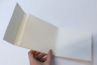
This is the net I have chosen for my packaging. I like how the simplicity of the design. The DVD and stickers slot into the top side of the case. And then they can be used to decorate your own DVD case.
I first chose this as my final design, but once it was printed I didn't like it as much so I decided to make the front side more simple.


Proof printing to check the readabilty and effectivenes of design layout:


This is my chosen design for the packaging:

Stickers for inside the case with the DVD will be cut out on the vinyl cutter.


DVD Design. Simple and clear using the snowflake

Sunday 13 February 2011
Colour Coding in After Effects
When working in after Effects with many layers, it was useful to use colour coding to organise the layers to make it less confusing, I did this with most of my pieces.


Saturday 12 February 2011
Idents in After Effects
Snowball Attack Ident: I think it is funny, but I don't think the transition from boy to snowman works too well. I am going to try it with the girl instead and keep the same hat and eyes on her and the snowman so you can tell it is her covered in snow.
Ident Idea 1 from Kirsty Hair on Vimeo.
The same snowball attack Ident but with different transitions for the credits. This one works better because there is a bit more movement in the piece. I have also added sound to it, and had it fade in and then fade back out.
Ident Idea 1 - 2 from Kirsty Hair on Vimeo.
Making a Snowman Ident: I really like this one I think I will definitely use it for one of my finals. I do need to add the sound to it yet.
Snowman Ident from Kirsty Hair on Vimeo.
Sledge Ident:
Sledge Ident from Kirsty Hair on Vimeo.
Snowball Attack Ident - with girl instead of boy
I prefer this one and I also like the snow covering the screen before the credits come on.
Snowball Ident from Kirsty Hair on Vimeo.
Snowball Attack Ident - made better
Snowman Ident 2 from Kirsty Hair on Vimeo.
Friday 11 February 2011
Title Sequence End Credits
Working with composition to create the Credits for the title Sequence. The order of hierarchy should be: 1. 'Snow Day', 2. 'Top 10 things to do', 3. 'Created by Kirsty Hair'
I feel the chosen one works the best and is clear.

The Snow Day appears through the mask as it moves vertically downwards to reveal the words (as if the snow is melting away) And then the 'Created by...' appears later.
Title Sequence end credits from Kirsty Hair on Vimeo.
In this next one I used an increase in scale for the 'Snow Day', I think this works better than the previous, as it works well with the snowball increasing in scale towards the viewer. I'm not sure if I like the footprints though:
Title Sequence end credits 2 from Kirsty Hair on Vimeo.
In this last one I prefer as it has more information with 'Snow Day', 'Top 10 things to do' and 'Created by Kirsty Hair'.
The 'Snow Day' increases in scale with the snowball. The 'Top 10 things to do' decreases in scale to its position and then the 'Created by Kirsty Hair' just appears, and they all work well to the music
I will use this for the title sequence ending:
Title Sequence (Final) End Credits from Kirsty Hair on Vimeo.
Thursday 10 February 2011
Packaging ideas
Another idea I had instead of making the packaging with a colouring book style, was to have another way of getting the children to interact with the packaging. Stickers. I will use my assets already created in illustrator to create the scenery on the packaging, and the characters, snowflakes, snowballs and sledge to create the stickers.


I like this design with the snowflake, however it seemed a bit flimsy and the snowflake would get bent. That may have just been down to the stock:

I really like this wallet style case were the DVD slots into the top, as it is simple. The whole case can be covered in snow scenery ad the stickers can slot inside too, and the children will be able to interact and decorate their case.

Credits - typeface
I printed off Snow Day in 'Valentine' typeface, and drew over it with snow on the tops of the letters, before scanning it back in.


Adding colour - I used the colour of the sky for the fill, and kept the snow white. Here with a black outline.

Here with a darker shade of the blue. Which I prefer as it is not as harsh.

'Created by...' in Helvetidoodle typeface -
'Top 10' - in the same typeface -
'Created by..' in Valentine typeface (same as Snow Day- minus the snow)
I will create some different composition and change the typefaces of the 'top 10' and 'created by' to see which works the best.
Wednesday 9 February 2011
DVD Packaging Ideas for Top 10
My main idea for the packaging design, was to have it as a colouring book, with black and white images, and maybe a pack of crayons packaged within.
A coloring book is a type of book containing line art for a reader to add color using crayons, colored pencils, marker pens, paint or other artistic media. Coloring books are generally used by children so this would work well for the target audience (children aged 8-10years) as it is an activity that age group engage in., and is appropriate. I think a this would work well with the cartoon images, as it would have a of comic strip feel to it. I will look at existing colouring books for inspiration. I have also considered the stock - cartridge paper is used mostly for colouring books as it is durable and if felt pens are used it doesn't bleed throught o the other side.
Here are some of my initial ideas:


Making prototypes from the nets:
In this one the cd will slot into one side and the stickers in the other


In this the DVD can slot into one side and the stickers in the other and the middle is left free for information and image.

The design I created for holding the crayons. I made each side the same width so when it is opened the case is flat and the child will be able to draw. The only problem is once the crayons have been taken out there is no support with the card.
Case closed:

Open:

Crayon holder:

Side view of opening mechanism:


Monday 7 February 2011
Title Sequence
My first test at using music with my animation. (Lilly Allen - Mr. Blue Sky)
I think it works really well with the movement of the sequence, and it is a fun and catchy song.
I have also put my seperate compositions together as one, and changed the transitions into eachother so they work better.
Title Sequence Coming Together from Kirsty Hair on Vimeo.
Abit more added to the sequence:
In the crit the feedback I got from the above video was to change how the girl is running down the street, as it is just one image. In this updated version I have included an other image of other foot and arm foreward, so it is as if she is running and I also have it bobbin up and down so it gives a better effect. I also need to make the clothes changing abit more fluid.
I have added the snow angel, and sledge scene, I think it is working well but there are still a few tweeks to do such as adding the snow to all the outside scenes, and adding the title at the end, after the snowball 'hits' the screen. There is about 4seconds left on the end of the sequence for that to fit into, as a lead into the programme itself.
Title Sequence (Almost there) from Kirsty Hair on Vimeo.
Saturday 5 February 2011
Ident Storyboards
Some ideas I have for the 4 x 10 second idents. The ideas came form the top 10 things to do when it snows, including drinking hot chocolate, making snowmen, sledging, snowball fights.


Defined a bit better:


Thursday 3 February 2011
Progress Crit with Fred
I found the progress crit with Fred to be very useful and it helped me to get a few things into perspective. The main thing I was concerned about was getting the work finished in time. This made me realise that I need to work more efficiently, and prioritize what needs to be done. In terms of creating the title sequence, I need to re focus the key stages that need to come across, before worrying about the rest (noise). For example, in my storyboard I want to show the girl waking up in bed, stretching, opening the curtains, seeing the snow and smiling. The main concept of this scene is for the girl to realise it's is snowing and that she is happy, so the scene could be cut down to just her eyes opening, the snow falling and her smiling. The could be useful if my title sequence runs over 50 seconds, and it will also make the scenes quicker and more catchy. I also need to think about what happens and what time in my sequence to get some idea of the timescale and how I will fit everything in.
I was then given a sheet with questions to answer, just to give me a check list of were my areas of focus would be, and to get everything into perspective, to ensure everything is completed in time:
'EVALUATION, FOCUS, DEVELOP - Key questions in the process of the project development'
Evaluation-
-What is the problem? Audience need ideas on what to do on snow days
-What subject area of study are you focusing on? Things to do on snow days
-To what depth are you investigating this area/subject? Is this sufficient? I have looked into activities, what people like to do on snow days, what to wear, safety. I think it is all sufficient and useful.
-What is the form and amount of research to date? Primary/secondary/imagery
-What visual material do you have to work with? What media/format is it? - Imagery/photographs/illustrations
-Is there an appropriate amount of work for the time you have had to develop it? Almost
-If there isn't why is this? How could you improve your work rate? I need to prioritise what needs to be done, and leave working on small subtle elements of my illustrations on Illustrator and AE, to the end, as they may not even be noticed by the audience.
-What is your timescale? When is the deadline? Wednesday 16th February
-What is achievable in the time available? Some final variations of the title sequence and idents and my chosen ones. An appropriate DVD packaging.
-What methods are you using to evaluate the progress of your ideas? Blogging/drawing/Illustrator/AE
Focus-
-What are you identifying as areas worth developing further? Storyboards/timescale/compositions and how my illustrators will animate and move into the frame/type
-What are you trying to communicate? Fun things to do on snow days
-What audience have you identified? Who are they? Children (8-10 years)
-What problem(s) have you identified? - Some things I want to do on AE, I need help with. Importing files from Illustrator to AE as my test videos have turned out quite blurred.
-How do you intend to solve these? Get help from staff or classmates, so I know what to do.
Development-
-Have you moved on from your initial starting point. If so how and why? - I think I have, with the style of drawings changing, working with a bright colour scheme, and reassessing my key stages in my animations.
-What methods are using to document this development? - Visual matertial (drawings/scans/Illustrator/colour experimentation/AE), blogging
-What processes will you need to use to develop your work? - Storyboarding/timescale, AE
-Do these require workshop access? - AE does as I do not have it on my own laptop, I need to use college computers, which can be hard as there is limited computers that have AE on them.
-When do you intend to access these workshops? - Try get to the studio computers earlier, get in the mac suite with AE when it is free.
TO DO:
-Get blog up to date with evidence of storyboards/development, etc
-Map rough sequence to AE for full 50 seconds
-Identify key events and ensure that you communicate them
-Concept for idents
Type Module - Lesson 4
Creating a flyer to get the audience to want their own allotment.
We had to choose either a consetina fold, or gate fold.
Having an allotment is a relaxing hobby, this must come across in the typeface used. Relaxed, stress free, and leisure. I chose Trebuchan for my main titles, and then Helvetica for the body text, they are both Sans Serif fonts, easily read and don't have a serious feel to them.
Hierachy was important, especially when opening the leaflet and making sure the audience reads in the right order that you want them to
Here is the front and back prints of my 'Gate Fold' flyer:

Tuesday 1 February 2011
Top 10 - After Effects Tests
This is the part of the title sequence after she realizes it is snowing outside.
I have only made subtle changes so that her mouth's smile get bigger, and her eyebrows raise upwards, but I think these are quite effective.
She is missing her freckles..but this was just a test.
Snow Smile from Kirsty Hair on Vimeo.
I then used this previous sequence, and used zoomed out so that you could see her full body, this will be the bit before she changes to her snow gear. I used 'easy ease' as it zooms out, to make the motion flow better.
Snow Smile Zoom out from Kirsty Hair on Vimeo.
In this I included a background so it looks as if she is in her bedroom. The in between section were it suddenly jumps from her pj's to her snow clothes' will be filled with stop motion of her arms moving out to the sides, and then a mask will move vertically down the frame removing the pj's picture with the snow clothes, so her clothes change.
Smile/Change with background from Kirsty Hair on Vimeo.
In this sequence, the girls clothes change, with the use of a mask that moves vertically down the screen and as it goes over the girl her clothes change to snow gear. The other accessories move on faster, because it is a rush to get changed. And then she runs off screen, again to emphasise her wanting to get outside as fast as possible.
Changing Clothes & Running Off from Kirsty Hair on Vimeo.
Falling Snowflake Experiments:
Snow from Kirsty Hair on Vimeo.
Falling snowflakes with a blue sky background and another layer of smaller snowflakes:
Snowflakes from Kirsty Hair on Vimeo.
Opening scene - girl waking up in bed:
Bed Yawn from Kirsty Hair on Vimeo.
I then put a motion blur onto her arms as they move upwards, to make it look faster and more 'real':
Bed Yawn - Blur from Kirsty Hair on Vimeo.
A test opening the curtains and zooming into the window -
Curtains Open from Kirsty Hair on Vimeo.
Opening curtains and with snow -
Curtains and Snow from Kirsty Hair on Vimeo.
With the girl opening curtains and then she fades out as it zooms into the window. I also slowed down the snow as it was moving too fast -
Girl Open Curtains and Snow from Kirsty Hair on Vimeo.
The girl sliding down the banister, this will be the scene between her getting changed and the street scene. Simple and fun:
Banister Slide from Kirsty Hair on Vimeo.
The first street scene - starts off looking into the sky and then moves down to see the houses - the girl then runs down the street before getting to a field wear her friend is. The snowflakes are yet to be added:
Outside Street Scene from Kirsty Hair on Vimeo.
The street scene - I changed the movement of the houses were they first come frame, so they move abit more upwards slightly and then down slightly.
The girl throwing a snowball is also added, but I don't really like the image of the girl, I will have to draw another image and then use a seperate layer for her arms as it throws the snowball.
Street Scene & Snowball Throw from Kirsty Hair on Vimeo.
Sledging scene - comes towards the viewer down the hill, the next scene will be the viewer in the sledge:
Sledging Scene from Kirsty Hair on Vimeo.
Boy making a snow angel - I used stop motion in this scene
Snow Angel from Kirsty Hair on Vimeo.
Viewer in the sledge scene-
I slightly chanegd this from the storyboard so the sledge seems like it is turning rather than jsut going straight down a hill, then the boy slides past and throws a snowball at you, as if revenge for her chucking it at him when he was making a snowman.
This is a fun scene and I think it would be good to use on an ident as it gets the fun element of snow day across quite clearly yet simple.
Sledge Ride from Kirsty Hair on Vimeo.
Top 10 - First Animation Tests - Snow Gear
This is the first animation I made to test out the character getting into her snow gear.
I think it is a bit slow, and not much going on, so I am going to test with the camera, zooming into the parts where the bits of clothes are coming on (e.g. zoom toward hand that glove is moving onto) yet keep her eyes in the frame, apart from when the boots come on, because the process of her getting changed should be a rush because it should seem as though she can't wait to get outside to play in the snow. I also want a background so it is not just white. But then again this was just a test.
Snow Gear from Kirsty Hair on Vimeo.
I changed this slightly so the jacket comes on at the same time, because the eyes looked as if they were moving too much.
Snow Gear 2 from Kirsty Hair on Vimeo.
Subscribe to:
Posts (Atom)