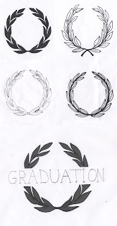
These leaves are recognised as a symbol of achievement, which makes them relative for graduation and also for LCA.
For the previous promotional designs a felt they were lacking a visual element and this could be it, even if just on a small scale.
I have drawn a few laurel wreaths that could be used within my promotional material.
For the research click Here
Vectoroised:
I scanned in my drawing and live traces them in Illustrator.
I changed the threshold of these 4 laurel leaves to see if there was much difference in the pattern.
I found that the ones with a higher threshold were more suitable, because you can still define the leaves:
Using this design idea within composition:


No comments:
Post a Comment