AIMS OF TODAY'S SESSION
1. Identify workflow
2. Analyse and evaluate websites
3. Identify purposes of websites - the target audience and the audience needs
4. Create an interface design for a website
**A website is the best way to promote yourself as it has the potential to reach people all over the world. It is a point of contact, it informs people about what you do. And their purpose is to get work/business.**
CONSIDERATIONS
Audience - potential/current clients, collaborators
Brand Identity - Style of website
What services are on offer
Work/Portfolio
Does it include a high impact statement
Is it busy/clean
Fit in frame
Readability - type/scale
Simplicity - could end up dull/boring
DONT USE A TEMPLATE - bespoke!
Navigation - clarity
Indexhibit - content driven
I will do many mock-ups, test them on people and get their opinions.
MANAGING FILES
Be organised
Labels/dates
Each web page in a seperate folder
Naming fold - lowercase with no spaces, 8 characters or less (less chance of currupt files)
root> subfolder images> contains images and other media, e.g. music, movies
MEASUREMENTS IN PIXELS
Display Resolution (useage across media - computer, mobile phone)
-lowest common denominator- 800x600, Res. 72pix/inch
WEB STANDARD
Restricted to standard font, what people have on their computers
Can specify an alternative font family for use within body text, for if someones computers don't have the font used.
Can work with image as a way around this - heading
However if type is an image people can't copy and paste - which can be good and bad
An image heavy site will take longer to load up - slow
Choosing colour - tick the web colours on box, works in hex codes - e.g. #ff066
Images need optimising for use on the web
Re-sample to 72res.
File>Save for webs & devices
Quality - reduce, file size
Must do this to every image
Bring mock-up designs for after Eatser, next session
Look at some advanced ideas (pic gallery, video, interactivity) for inspiration, and to fidn out how to do it.
Wednesday 30 March 2011
Design for Web
Today we had our introduction to web design. I have to design a website for our graphic design studio, in conjunction with the Enterprise brief. Here is the interface I came up with, with the information that my website neeeds to include:


My Design Direction

Each one of these sub-headings can drive the outcome for any brief.
This has helped me realize what I want to do more of, what skills I want to develop, and what direction I want to go in.
Brief Title: Design for Web
THE BRIEF
Create a 5 page website for the design studio you are proposing to set up, in conjuntion with the Enterprise brief.
CONSIDERATIONS
-Functionality- working links, can peopel follow it
-Aesthetics- what looks good may not be functional
-Useability
-Content- what do I need to show, how am I going to show it (text/image)
-layout/font size/composition/image size
TARGET AUDIENCE
CONCEPT PROPOSITION
MANDATORY REQUIRMENTS
-5 page website
-document, evaluate work on D.P and D.C blog
-reserach websites- what works, what doesn't, what comes across when you look at a website
DELIVERABLES
STUDIO DEADLINE
Friday 27th May
Thursday 24 March 2011
Final Presentation Boards for YCN Submission
We changed our boards after the crit, considering the feedback we received. We know feel these work better and communicate our idea effectively:
M&S Plan A - Final Products
Here is our final range for the M&S Plan A campaign:
Logo:

Billboards:
Climate Change:
 Fair Partner:
 Health:
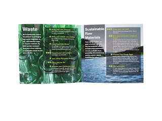
 Sutainable Raw Materials:
 Waste:

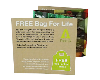
Bag For Life: (Image - front, Information - back)
Health:

 Climate Change:

 Fair Partner:

 Sustainable Raw Materials

 Waste:


Window Display:


Leaflet:


Logo:

Billboards:
Climate Change:


Bag For Life: (Image - front, Information - back)
Health:


Window Display:


Leaflet:


Wednesday 23 March 2011
Window Display
I mocked up what our window display would look like in a store window in Photoshop, so we could use it in context for our boards.
Artwork:


Artwork:

Mock ups:

We feel this below image works better as the above image may be confused and not seen as a store window. We will use this on our boards.

Leaflet Photography
I took some photos of the final leaflet to use on the boards here are a few edited:


Tuesday 22 March 2011


Monday 21 March 2011
Leaflet Design Development
For the front cover we decided to just include the Plan A log and the M&S logo, as all the information will be inside.
Composition experiments:


This central logo is our preferred composition as it creates a focal point and shows its all about Plan A.

The About page composition. In this the body text is quite small so I need to increase the scale, but I will then need to make the collumn wider.
The difficulty rating key of the stars is also included.

For the 'About Plan A' page and the outside pages of the concertina I experimented with the brown paper look, similar to the window display. I really like this, and it has a more 'natural' quality to it.

I increased the scale of the body text and I increased the collum width to the whole size.

For the back page of the concertina - FREE Bag For Life -

I experimented with the composition. I preferred the quote alone at the bottom and moved the web address under the Free Bag info.

I then changed the colour of the coupon to green, moved the position of the logo and changed the quote to white. To create a balance with the white title .

I changed the composition for the pillar information so the pledges appear in a list rather than in two separate collumns, this looks cleaner and easier to read. It also works with the stars down the side of the collumn for each pledge.

Adding some leading to the text under the title and the pledges. I also lowered the baseline of the pledge info, to create more emphasis on the pledge itself and make it stand out from the information.

We decided that using the same images as from the billboard, would help in making the leaflet more visually engaging. However, we like the idea of having the brown paper for the outside in contrast to when you open out the concertina, and are able to see all the colour from the images.
I have chosen just one pillar page to show the development, to make the changes clear. The changes I made reflected across each pillar.

In the image above the title is in line with pledges text, however I then moved the title up so it was in line with the opacity box and this seems to work better.

The text under the the title was hard to read in white so I experimented with a black outline.

After printing the above style, the white text with the black outline under the title was hard to read on some of the images. So I experimented with using another opacity box, to make the text more clear.
I also thought the opacity under the pledge seemed quite dark, so I decreased the opacity from 75% to 55% and this was a lot better, as it allowed you to see more of the image.

This worked better but it seemed liked the boxes were ruining the image behind.
I decided to add a gradient to the title box so it faded into the image behind, this worked a lot better.
The full leaflet design:


However after printing this design, we realised some of the body text was still hard to read over the images. I then made some subtle changes, using the outer glow effect, in black, to emphasize and bring out the white more. I also did used this same effect on the front page to emphasize the logo, and so I could make the brown background a bit darker.


I then changed the shape of the coupon to the shape of a bag for life, to make it more visually interesting and appropriate. I also justified the text on the first page and back page.
Final Leaflet ready for print:


Subscribe to:
Posts (Atom)