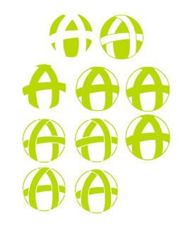
It is in the shape of the 'A' but it also looks as if there is a tree in the white space in the middle.
I decided to play around with this logo idea a bit more, to make it look more 'tree like'.
I prefer the logo with the slight surved edges at the bootom of the tree, which in the image is the centre logo of the lighter greens. It is only subtle but makes a great difference.
I also experimented with the M&S green and also a darker one to see which worked better.
Another logo I had vectorised before the crit but liked, I decied to play aroudn with.
The idea is that the circle represents the world, and the strips that make up the letter 'A' are as if they are wrapped around the world, protecting it.
All we need to do now is decided between us, which logo we thinks works the best.


No comments:
Post a Comment