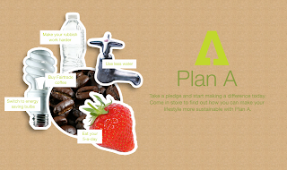
In the feedback form the crit, we realised there isn't enough information on the display, and it is seems quite plain and boring, as there isn't any interaction. We decided to use separate images for each pillar rather than having the strips, as they wern't very visually intriguing. The images to represent each pillar
Climate change - Energy bulb
Waste - plastic bottle
Sustaintable raw materials - water tap
Fair partner - coffee beans
Health - fruit/strawberry
The idea is to hang the images separately to create some depth. This would be using fishing wire so you cannot see it.
I experimented with the backdrop. The brown gives it a more recycle feel as it is the colour of cardboard. It seems to work well in making the images stand out clearly.
We then thought it would be more interesting to add some pledges to each image, so as to not make them look 'random'. I think this works well.
I also had to change the images, as the first set I used were just off the internet, so I got some similar stock images from deviant art, so we can ask for permission to use them. They seem to work just as well.
I then added some leading to the type under the logo to make it more readable. We decided this type and the logo could be printed onto the backdrop rather than stuck onto the window, so then people will be able to read it easier when they look into the window. It also means there won't seem as if there is a big space between the type and the backdrop, than if it was on the window.
This is how the separate would be printed in terms of proportion, with the pledges attached to their image.
Applying it to a shop window to get a feel for how this would look in context.


No comments:
Post a Comment