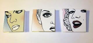
I experimented with cropping the face for designs on the face powder, and cheek blush compact labels. I then changed the colours on each and put different opacity's on them.
I created one for each icon with the more simple logo. These proved quite effective, however It causes problems on the back for the information to go.
These how they would look on the compacts:
Using the white inner circle and coloured frame (a colour from the 40s colour palette) to represent the colour of the cheek blush.
Using this same style for the powder but this time with a blue frame (another colour from the 40s palette), this is not the colour of the powder (obviously) but it is a colour that represents that decade and as commonly used. They seem quite plain though.
Using this image of Lana I did some experiments for the compact label:
As the Twiggy 'Shadow' label with the coloured face, was quite distracting, I have used the white inner circle again for this design-
And experimented with type. I still do prefer this type on the image below.
Design for the back of the cheek blush compact. Same central layout as the 'Twiggy Shadow' but with the correct information for the product.
Final Cheek Blush design
I have used the same design for the Face Powder, the only difference being the information on the back and the title from 'Cheek Blush' to 'Face Powder'.
Front:
Back:
I had to design an eyebrow pencil label, to work with these compact labels, so I did with the Twiggy label for the mascara and eye liner, I have used the coloured face image and cropped it so you can see the eyebrows, as this is the focal point for this particular product. I have also added the gradient to the logo and text to make it easier to read, and to make it consistent with the other products.


No comments:
Post a Comment