

Still using the animals I tried to come up with a more solid concept. I looked into different combinations of animals and how each of them could represent the books, either through their colour or personality. And then whether they war animals from a specific place e.g. zoo, wild, sea, aquarium. I really like the wild animals and the idea that Fedrigoni has gone wild with the Imaginative colours tool.

I narrowed my animals down to 4 - one for each book.
The tiger would be used for the warm book representing the colours of red/orange/yellow
The Peacock would be used for the cool book representing the colours of green/blue/purple
The Giraffe would be used for the neutral warm book representing the colours of brown/beige/cream
The zebra would be used for the neutral cool book representing the colours of black/grey/white.
I thought about how this could be used for the mail shot. using just one main colour from each animal and using it with black and white which the animals could stencil into, so the consumer could interact and move the stencils over the colours.
Or all the colours for each book could be used as a gradient with stencil of their animal over them to represent the array of colours for that particular book. - I like this idea and feel it has potential.
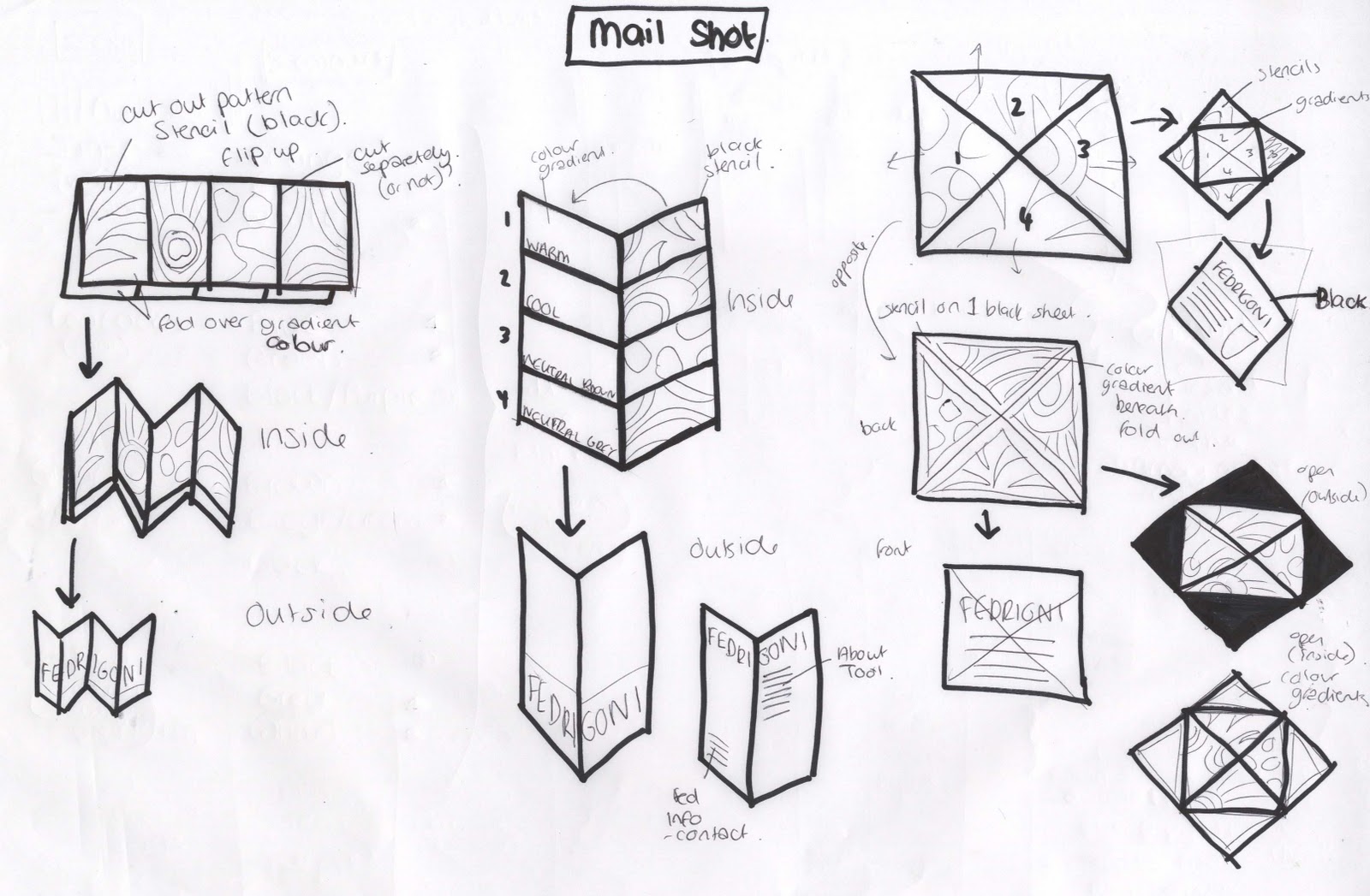
I really like the poster wrap idea shown below. As there are a few pages to work with before reaching the inside of the mail shot. These could all hold different sections of information about the tool and lead the consumer into the mail shot. The wrap cold have a slide out poster containing gradients of the colour, which could be seen throughout he stencil of the animal cut into the mail shot poster wrap, and then once it is taken out, can have information about each book.


The idea of it begin a Fedrigoni zoo, since I am using the animals. I tried to think o fsoem wording to make this concept stronger.

The webpage needs to be the contact point for the customer and a place where they can find out more about the tool, and order their own. design for the webpage could have a zoo style with the animal coming out of grass, or even using a map of a zoo in the background that once you click on an area of the map for an animal, it takes you to that colour book.

The magazine needs to represent the tool and inspire the target audience to want to have their own. I think having 4 posters - one for each book- would work the best as they could work consecutively one after the other. The information included needs to direct the audience to the web page were they can find out more about the tool. I think the language used for this will be very important in attracting the consumer.

I really like the poster wrap idea and feel it has the most potential so I worked out how the dsing will work across an A2 sheet of paper...

Mail Shot:
Poster Wrap Design:
I then mocked this up and got it printed to see how it works, and how the consumer can interact with it. I like this idea but it needs a few tweaks and some more information included.

No comments:
Post a Comment