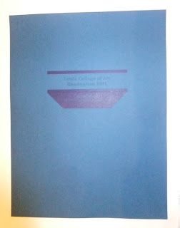
Here are some simplified ideas I had first for the wallet.
They will be printed onto blue board with a metallic ink for the type. The darker blue represents a spot varnish and it will also be dye cut for the slip with the graduates names to be slotted into. This is shown within the designs.
I particularly like the designs with the spot varnish strip above and below the 'Leeds College of Art' text with the dye cut on the edge of this. It is a simple design yet puts emphasis on the text, and I feel is a more appropriate design idea.
Using this design across to the programme book. However I prefer the inside pages with the lines that break up the information.
Open publication - Free publishing - More design
I pretend these design on a few different coloured block stocks but they are not the right shade that I am after, but the wallet gives an idea of how the ticket slot would work.
I pretend these design on a few different coloured block stocks but they are not the right shade that I am after, but the wallet gives an idea of how the ticket slot would work.


No comments:
Post a Comment