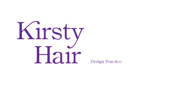
These other typeface are still bold but have more to them in terms of being more visually interesting and they look less corporate:
I changed the A to the Swedish A and changed the kerning of the letters to make them more balanced. I feel these are more visually interesting than the arial typeface and have an edge to them.


No comments:
Post a Comment